
Foro
13.711 posts Fuentes identificadas
Posts de koeiekat


Fuente identificada: The Low Down

Based on the T and O I suggest one of the many Garamonds around.
Editado el 26/08/2015 a las 14:56 por drf
Fuente sugerida: Garamond
Editado el 26/08/2015 a las 14:56 por drf
Knitting letters together does not by definition produce understandable text.

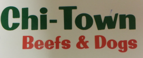
Fuente identificada: Machiarge
... and the 'f'.

Fuente identificada: Amatic SC
Fuente identificada: Golden State
How did you install the fonts?


Fuente identificada: Strumpf
Up goddamnit it said. Original image: http://img15.hostingpics.net/pics/814777Lool.png does not sound as a screenshot. Were it a screenshot pressing Ctrl+ a few times would have produced an image with larger characters. So if it were it could have posted an image with larger letters without any need to enlarge the image.


For the &, Sakkal Majalla, a Windows System font, so you have it.
Editado el 26/08/2015 a las 10:40 por drf
Fuente sugerida: Sakkal Majalla
Editado el 26/08/2015 a las 10:40 por drf
Fuente identificada: Cardenio Modern
Go out and do a few thingies SkyDraws ... get yourself a magnifying glass ... get yourself a course on how to handle that magnifying glass ... find yourself a course on reading and follow that course to the end... but most important of all and before all ... get yourself a brain transplant ... you desperately need one ... does not need to be a brain with a high IQ ... 23 will do for you ... already a huge improvement in your case.
At 40 dollar a face with a far more extensive character set (which includes all the characters of the Saginaw)Laramie Pro seems to be a better buy that the Saginaw at 49$ a face. 


Fuente identificada: School Book New


Huso horario CEST. Ahora son las 00:11
