
Foro
13.590 posts Fuentes identificadas Sólo solicitudes
Posts de Heron2001

Awfully close to mehl is Bliss Pro - http://typography.net/try/?ff=27&f=149 and
boris looks like someone handtailored TheSans: http://www.fontshop.com/fonts/downloads/lucasfonts/thesans_basic/
boris looks like someone handtailored TheSans: http://www.fontshop.com/fonts/downloads/lucasfonts/thesans_basic/

It looks like someone had fun eroding Franklin Gothic Extra Condensed
Editado el 24/08/2012 a las 01:28 por rocamaco
Fuente identificada: Franklin Gothic Extra Condensed
Editado el 24/08/2012 a las 01:28 por rocamaco
I'm drinking Californian these days - in fact, I think it's time to pour a glass - tonight it is a Meritage from Sterling....
Fuente identificada: Caslon Open Face

It is similar to Century Gothic. (BerthoCnui) I don't know where they got the l, s or g from...
Fuente sugerida: Century Gothic
I think it was Vinz who made the original - but if you have pull with RoRo - go ahead - he no longer responds to me... 

Oh but my glasses need wine in them... 

Linotype has the correct K (the other ITC manufacturers have a different K)
Fuente identificada: ITC Avant Garde Gothic Extra Light
Nice.... 

Wow - who'd have known... nice ID pilaster...
Thank you - I always wondered where I'd fit in....  (only it's a wine toast... we don't touch beer)
hey drf - they took away my wine cheer???? BOO HOOO
 (only it's a wine toast... we don't touch beer)
hey drf - they took away my wine cheer???? BOO HOOO


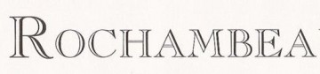
Fuente identificada: Copperplate
Also close - it might have been handtailored using Journal Book and Journal Italic (backslanted)
http://www.myfonts.com/fonts/paratype/journal/
http://www.myfonts.com/fonts/paratype/journal/
There are so many similar ones.... lol
Thanks Sashi - I've taken a second look and you are correct - the G matched (unlike JH Titling) but I see the curves now that are in the font and not in the sample... so we agree - close but no cigar.
Thanks Sashi - I've taken a second look and you are correct - the G matched (unlike JH Titling) but I see the curves now that are in the font and not in the sample... so we agree - close but no cigar.
or camc - they used the font that malvollo kindly placed in the thread before yours. 

Yes and paranoid too... 


Fuente sugerida: Porscha
Psss camc - it is Georgia... shhhhh.
http://www.myfonts.com/fonts/adobe/caliban/ - looks like it to me.
BUT... because of the "a" it might be: http://www.myfonts.com/fonts/paratype/pt-script-barguzin/
Editado el 23/08/2012 a las 20:53 por Heron2001
BUT... because of the "a" it might be: http://www.myfonts.com/fonts/paratype/pt-script-barguzin/
Editado el 23/08/2012 a las 20:53 por Heron2001
Or you can buy the commercial font - and not worry.
http://www.myfonts.com/fonts/bitstream/cloister-black/cloister-black/
http://www.myfonts.com/fonts/bitstream/cloister-black/cloister-black/
Huso horario CEST. Ahora son las 10:33
