
Foro
13.590 posts Fuentes identificadas Sólo solicitudes
Posts de Heron2001

You are welcome - good luck with your project.

Fuente identificada: HFF Pessoas Lindas

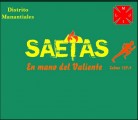
Fuente identificada: Trajan


Except for the "R" - it seems to be very much like Google's Web Font - Italiania
Fuente sugerida: Italiana

Fuente identificada: Hursheys
You are most welcome.
BTW - URW also has the second font - I think they called theirs Blizzard....
BTW - URW also has the second font - I think they called theirs Blizzard....
See if you have Compacta on your computer - very close.
Fuente identificada: Rusted Plastic

Fuente sugerida: Glypha 45
You are most welcome.
And I'm glad I could be helpful - Thank you.
And I'm glad I could be helpful - Thank you.
Very impressive Rocamaco... 


The "G" I'm not sure of - I'd say it was probably hand-modified.
The rest looks like good old Impact - with a "handtooled" special effect added in Adobe's Photoshop
The rest looks like good old Impact - with a "handtooled" special effect added in Adobe's Photoshop
Fuente identificada: Impact

It looks like Futura was its base - and the designer handtailored it for the logo.
But if you own Phosphate Solid Medium/Bold - the shapes are closer to start from....
Editado el 09/07/2013 a las 12:59 por Heron2001
But if you own Phosphate Solid Medium/Bold - the shapes are closer to start from....
Fuente sugerida: Phosphate Solid
Editado el 09/07/2013 a las 12:59 por Heron2001
Something like Obrigado - http://www.myfonts.com/fonts/hanoded/obrigado/
I see we are agreed that it isn't Goudy Handtooled...
I had to take a look at them condensed - I'll share - I like the N in the ITC Century the upper left looking good...- but maybe it is some other Handtooled - the H just doesn't seem right (maybe condensed more - or from a different manufacturer's font?)
Thanks fmontpetit - it's nice playing with type again... we need more pointyness on the lower right side of the N - and less "handtooling" in general on both...

Editado el 09/07/2013 a las 00:12 por Heron2001
I had to take a look at them condensed - I'll share - I like the N in the ITC Century the upper left looking good...- but maybe it is some other Handtooled - the H just doesn't seem right (maybe condensed more - or from a different manufacturer's font?)
Thanks fmontpetit - it's nice playing with type again... we need more pointyness on the lower right side of the N - and less "handtooling" in general on both...
Editado el 09/07/2013 a las 00:12 por Heron2001
Claude - I think they might have in the OT fonts - because on the ITCFont site they mention you can access all alternatives - but I'm trying to see if they do exist... http://www.fonts.com/font/itc/itc-lubalin-graph/demi -- But since I'm on the MINI Mac - the font programs I use to use to open fonts and peek... no longer work and I cannot justify spending the money to buy ones that will...
Voila - some of us were professional typographers... start singing - "Those were the days....."
PS - perhaps you know someone who still has a typositor and the film fonts?
Editado el 08/07/2013 a las 20:10 por Heron2001
Voila - some of us were professional typographers... start singing - "Those were the days....."
PS - perhaps you know someone who still has a typositor and the film fonts?
Editado el 08/07/2013 a las 20:10 por Heron2001
Huso horario CEST. Ahora son las 13:22
