
Foro
3.821 posts Fuentes identificadas
Posts de donshottype

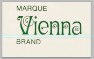
Ringlet, a Victorian typeface by Hermann Ihlenburg, 1882

Source: Luc Devroye.
Digitized by Dan X. Solo and included in the CD packaged with the Victorian Aphabets book published by Dover in the 1990s. All letters match your image.
AFAIK, No legitimate download for the Dan X. Solo Ringlet.
Also digitized as Aridi 09
http://www.aridi.com/images/fonts/09.gif
Also digitized by George Williams, eith the name Ringlet, but with a different _n_ than the one shown in your image.
More info:
https://fontsinuse.com/typefaces/7581/ringlet
Editado 5 veces. Última edición el 03/07/2017 a las 21:26 por donshottype
Source: Luc Devroye.
Digitized by Dan X. Solo and included in the CD packaged with the Victorian Aphabets book published by Dover in the 1990s. All letters match your image.
AFAIK, No legitimate download for the Dan X. Solo Ringlet.
Also digitized as Aridi 09
http://www.aridi.com/images/fonts/09.gif
Also digitized by George Williams, eith the name Ringlet, but with a different _n_ than the one shown in your image.
More info:
https://fontsinuse.com/typefaces/7581/ringlet
Fuente identificada: Ringlet
Editado 5 veces. Última edición el 03/07/2017 a las 21:26 por donshottype
Corporate logo.
Website:
https://www.miele.de/
Vector outline of _Míele_ in company publications. For example:
https://www.mieleusa.com/domestic/brochures-manuals-385.htm#p507
Editado 2 veces. Última edición el 03/07/2017 a las 12:16 por donshottype
Website:
https://www.miele.de/
Vector outline of _Míele_ in company publications. For example:
https://www.mieleusa.com/domestic/brochures-manuals-385.htm#p507
Editado 2 veces. Última edición el 03/07/2017 a las 12:16 por donshottype

Fuente identificada: Premier Shaded

The second approximate match is
Moderno FB Condensed Bold
https://store.typenetwork.com/foundry/fontbureau/fonts/moderno-fb?filter_weight=700&filter_width=400&filter_posture=0
But note the different design for the lower rhs of _G_ and _R_
Editado el 03/07/2017 a las 11:01 por donshottype
Moderno FB Condensed Bold
https://store.typenetwork.com/foundry/fontbureau/fonts/moderno-fb?filter_weight=700&filter_width=400&filter_posture=0
But note the different design for the lower rhs of _G_ and _R_
Fuente sugerida: Moderno FB Condensed Bold
Editado el 03/07/2017 a las 11:01 por donshottype
Your image has the letters:
ABCDEGHLNORSTU
No font found with an exact match to all of them.
Two fonts are close to most of the letters. The first is
Benton Modern Display Condensed Bold
But note the different design for the lower rhs of _G_ and _R_
Editado el 03/07/2017 a las 11:00 por donshottype
ABCDEGHLNORSTU
No font found with an exact match to all of them.
Two fonts are close to most of the letters. The first is
Benton Modern Display Condensed Bold
But note the different design for the lower rhs of _G_ and _R_
Fuente sugerida: Benton Modern Display Condensed Bold
Editado el 03/07/2017 a las 11:00 por donshottype

Closest I found to the lettering and/or logo of _AMERICAN JEANS_ is Knockout No. 47 Bantamweight.
Main difference is that Knockout does not have a straight leg on _R_
Editado el 01/07/2017 a las 10:39 por donshottype
Main difference is that Knockout does not have a straight leg on _R_
Fuente sugerida: Knockout No. 47 Bantamweight
Editado el 01/07/2017 a las 10:39 por donshottype

An original design by a neon signmaker.
Di Mare's line weight an be overlaid on its regular weight to create the image's effect of neon tubing in a thick monoline frame.
Some letters are similar to the _Bestat tungsten_ sign while others, such as _n_, are quite different.
Editado 2 veces. Última edición el 29/06/2017 a las 22:15 por donshottype
Di Mare's line weight an be overlaid on its regular weight to create the image's effect of neon tubing in a thick monoline frame.
Some letters are similar to the _Bestat tungsten_ sign while others, such as _n_, are quite different.
Fuente sugerida: Di Mare
Editado 2 veces. Última edición el 29/06/2017 a las 22:15 por donshottype
Fuente identificada: Playbill

Fuente identificada: Korinna

1. The _F_ is rotated counterclockwise
2. Alternate _l_
http://www.myfonts.com/fonts/fenotype/salamander/regular/glyphs.html#glyphs/566437/149
2. Alternate _l_
http://www.myfonts.com/fonts/fenotype/salamander/regular/glyphs.html#glyphs/566437/149
Fuente identificada: Salamander Script
Perhaps a custom creation by Disney studios.
The geometric letters look derived from Pump, which is NOT THE FONT.
Some possibilties:
... _s_ no major change
... _W_ no major change
... _h_ no major change
... _d_ no major change
... _B_ close gap in bottom stroke
... _t_ with bottom of _u_ pasted to bottom of _t_ and cross stroke extended.
... _f_ flip the composite _t_. The design result is resembles the _F_ in pump
... _r_ clip of the bottom portion of the rhs of _n_
Expanded horizontally, which produces the thicker vertical strokes and the increased slope.
Fuente identificada: City Bold Italic

Movie released in 1978.
Based on a predigital Garamond Italic. Monotype's Garamond Italic had swashes like the ones on _D_ and _n_. Digitized glyphs shown at
http://www.myfonts.com/fonts/mti/garamond/mt-swash/glyphs.html
Various digital Garamond Italic's some closer than others. For example check the _w_ in the MyFonts search results
http://www.myfonts.com/search/garamond+italic/
AFAIK no exact match to all of these letters.
Editado el 26/06/2017 a las 09:34 por donshottype
Based on a predigital Garamond Italic. Monotype's Garamond Italic had swashes like the ones on _D_ and _n_. Digitized glyphs shown at
http://www.myfonts.com/fonts/mti/garamond/mt-swash/glyphs.html
Various digital Garamond Italic's some closer than others. For example check the _w_ in the MyFonts search results
http://www.myfonts.com/search/garamond+italic/
AFAIK no exact match to all of these letters.
Fuente sugerida: Garamond Italic
Editado el 26/06/2017 a las 09:34 por donshottype

Fuente identificada: Cooper Black Italic
For some of the lines you can make a drop shadow effect with a vector drawing program like FontLab or Illustrator and edit the lines manually.
However these lines are not consistently placed to match drop shadows. For example the _N_ has an lhs stroke that shadows to the SE, but the diagonal shadows to the NE. Same for the top and bottom terminals of _C_.
Shifting perspective is like an M.C. Escher drawing.
However these lines are not consistently placed to match drop shadows. For example the _N_ has an lhs stroke that shadows to the SE, but the diagonal shadows to the NE. Same for the top and bottom terminals of _C_.
Shifting perspective is like an M.C. Escher drawing.

This is what Europa looks like when expanded by 180%.
And when it is sloped right 22 degrees.

Not a 100% match, but a passable substitute for the logo letters.
And when it is sloped right 22 degrees.
Not a 100% match, but a passable substitute for the logo letters.
I extracted this higher resolution image from a specimen of the wine label:

Also the company's label for another wine:

Differences in at least some repeating letters, that would not be explained simply by the different width of the letters. Note for example the different legs on the three instances of _R_.
In my opinion this is hand lettered.
Similar to Neutra Display, but THIS IS NOT THE FONT.
Editado 2 veces. Última edición el 25/06/2017 a las 22:18 por donshottype
Also the company's label for another wine:
Differences in at least some repeating letters, that would not be explained simply by the different width of the letters. Note for example the different legs on the three instances of _R_.
In my opinion this is hand lettered.
Similar to Neutra Display, but THIS IS NOT THE FONT.
Editado 2 veces. Última edición el 25/06/2017 a las 22:18 por donshottype

Gotham Narrow Ultra, Modified
Compare here
https://try.typography.com/?font=100008
Compare here
https://try.typography.com/?font=100008
Fuente identificada: Gotham Narrow Ultra

Times using Small Capitals From Capitals
http://www.myfonts.com/fonts/adobe/times/roman/glyphs.html#glyphs/553071/332
http://www.myfonts.com/fonts/adobe/times/roman/glyphs.html#glyphs/553071/330
http://www.myfonts.com/fonts/adobe/times/roman/glyphs.html#glyphs/553071/331
http://www.myfonts.com/fonts/adobe/times/roman/glyphs.html#glyphs/553071/335
Fuente identificada: Times

Fuente identificada: Chesterfield
Huso horario CEST. Ahora son las 14:58
