
Foro
3.821 posts Fuentes identificadas
Posts de donshottype

The leg extension on _R_ is based on a feature in Bullet Small Caps Script.
Scroll through the glyph charts at the bottom of the page until you find this version of Bullet. It is not shown in the main list at the top of the page.
Scroll through the glyph charts at the bottom of the page until you find this version of Bullet. It is not shown in the main list at the top of the page.

Fuente identificada: Bullet

Fuente identificada: Serpentine Bold

Letters and numbers in a stamping machine which, AFAIK have not been made into a font.
This style of letters and numbers is found in assorted fonts but I have not spotted any single font with a match for all of them. To reproduce the text in the image -- without font editing -- you would have to pick and choose from several fonts.
Simplon is perhaps closest for most of them.
Check out the similar fonts shown at Identifont for the others
http://www.identifont.com/find?font=Simplon&q=Go
Most of them are less expensive than Simplon, which seems to be sold only on a package basis.
However, if you qualify as a student, there is a large discount for Simplon.
Editado el 11/07/2017 a las 09:54 por donshottype
This style of letters and numbers is found in assorted fonts but I have not spotted any single font with a match for all of them. To reproduce the text in the image -- without font editing -- you would have to pick and choose from several fonts.
Simplon is perhaps closest for most of them.
Check out the similar fonts shown at Identifont for the others
http://www.identifont.com/find?font=Simplon&q=Go
Most of them are less expensive than Simplon, which seems to be sold only on a package basis.
However, if you qualify as a student, there is a large discount for Simplon.
Fuente sugerida: Simplon
Editado el 11/07/2017 a las 09:54 por donshottype

Might be custom lettering for the logo.
Substitutes would be in the style of Latin serifs, i.e. triangular serifs.
For example, consider Latin CT -- but note that THIS IS NOT THE FONT
Substitutes would be in the style of Latin serifs, i.e. triangular serifs.
For example, consider Latin CT -- but note that THIS IS NOT THE FONT
Fuente sugerida: Latin

Apparently this is the full alphabet for the Toronto Raptors basketball team, which has some minor differences from the RAPTORS logo shown in your image:

Major league sports teams generally use custom fonts as part of their brand identity. So the Raptors letters are probably custom.
If you merely want to duplicate the the word _RAPTORS_ you could use United Sans -- NOT THE FONT -- or one of several other chamfered sans fonts.
Editado 3 veces. Última edición el 11/07/2017 a las 07:37 por donshottype
Major league sports teams generally use custom fonts as part of their brand identity. So the Raptors letters are probably custom.
If you merely want to duplicate the the word _RAPTORS_ you could use United Sans -- NOT THE FONT -- or one of several other chamfered sans fonts.
Fuente sugerida: United Sans
Editado 3 veces. Última edición el 11/07/2017 a las 07:37 por donshottype

For something similar consider Mostra Nuova Black and imagine that the _B_ was transformed into an _R_ by clipping an opening in the bottom and straightening the lower rhs into a vertical leg.
Also imagine that a _U_ was flipped upsidedown and a cross stroke added to make an _A_.
Finally imagine that the counters on _A_ and _R_ became little circles.
Editado el 09/07/2017 a las 19:54 por donshottype
Also imagine that a _U_ was flipped upsidedown and a cross stroke added to make an _A_.
Finally imagine that the counters on _A_ and _R_ became little circles.
Fuente sugerida: Mostra Nuova Black
Editado el 09/07/2017 a las 19:54 por donshottype

Edited
The sharp angle leading to the serif terminals on _C_, _G_ and _S_ is converted to a smooth curve.
The leg on _R_ is made more relaxed.
The mid terminal on _G_ is shifted down.
Pointed tips for _A_, _V_ and _N_.
Might be a couple more tweeks that I didn't notice.
Editado el 09/07/2017 a las 00:42 por donshottype
The sharp angle leading to the serif terminals on _C_, _G_ and _S_ is converted to a smooth curve.
The leg on _R_ is made more relaxed.
The mid terminal on _G_ is shifted down.
Pointed tips for _A_, _V_ and _N_.
Might be a couple more tweeks that I didn't notice.
Fuente identificada: Chronicle Display Condensed Bold
Editado el 09/07/2017 a las 00:42 por donshottype

Fuente identificada: Hobo

Some edits including:
Curl pasted to terminal of _r_
Gap cut in top of _y_ and gap closed near baseline of _y_
Top rhs of _g_ bulged out.
Dot of _i_ made smaller and moved down.
Curl pasted to terminal of _r_
Gap cut in top of _y_ and gap closed near baseline of _y_
Top rhs of _g_ bulged out.
Dot of _i_ made smaller and moved down.
Fuente identificada: Hansa Gotisch

Revised post:
This is artwork by Steve Marsh in 2016 titled, "Vintage Radius Movie Title"
https://dribbble.com/shots/2755607-Vintage-Radius-Movie-Title
If you ask Steve Marsh he might provide a backstory:
https://dribbble.com/the_steve_marsh
No matching fonts but it has some echos of what Bauhaus might look like if pumped up to ulta black weight.
Editado 3 veces. Última edición el 09/07/2017 a las 19:54 por donshottype
This is artwork by Steve Marsh in 2016 titled, "Vintage Radius Movie Title"
https://dribbble.com/shots/2755607-Vintage-Radius-Movie-Title
If you ask Steve Marsh he might provide a backstory:
https://dribbble.com/the_steve_marsh
No matching fonts but it has some echos of what Bauhaus might look like if pumped up to ulta black weight.
Fuente sugerida: Bauhaus
Editado 3 veces. Última edición el 09/07/2017 a las 19:54 por donshottype
Fuente identificada: Blenny
Fuente identificada: Blenny
Bombardier matches the features but is a trifle wider.
Perhaps Tradesman Cond Bold?
Perhaps Tradesman Cond Bold?
Fuente sugerida: Tradesman Cond Bold
Hudson NY is close but has chamfered counters rather than the squared counters in the image.
As a BW image sloped left 8 degrees:

Font recognition software at WhatTheFont didn't produce any proper matches.
Perhaps custom?
Editado 2 veces. Última edición el 06/07/2017 a las 10:17 por frd
Font recognition software at WhatTheFont didn't produce any proper matches.
Perhaps custom?
Editado 2 veces. Última edición el 06/07/2017 a las 10:17 por frd
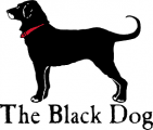
This is a version of Fifteenth Century by Bernd Nadall for Barnhart Brothers & Spindler 1897 ca..
Renamed Caslon Antique in 1918ca. A note at MyFonts says that
---quote---
Printing historian Alexander Lawson tells us that with its new name the typeface became the most commonly selected type for reproductions of colonial American printing and notes its modern popularity in everything from liquor advertisements to furniture commercials.
---end quote--
So far I have not found an exact match to this lettering -- it might be relettered -- but any of several versions of Caslon Antique could be used as a very close substitute.
The Black Dog logo dates from 1971
https://en.wikipedia.org/wiki/The_Black_Dog
So the lettering is based on a predigital version of Caslon Antique.
Fuente sugerida: Caslon Antique

Looks like a fusion of ITC Cushing Italic and ITC Bookman Italic.
Editado el 04/07/2017 a las 11:31 por frd
Fuente sugerida: Cushing
Editado el 04/07/2017 a las 11:31 por frd
Huso horario CEST. Ahora son las 03:06
