
Foro
9.165 posts Fuentes identificadas Sólo solicitudes
Posts de fmontpetit


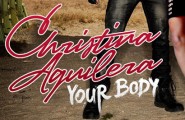
Fuente identificada: Calligraphic 421
It looks like an octogonal version of Square Slabserif 711 Bold...
Editado el 15/10/2012 a las 22:20 por Heron2001
Fuente identificada: Square Slabserif 711
Editado el 15/10/2012 a las 22:20 por Heron2001

Fuente identificada: LHF Classic Caps
LOL
Malvolio. I was referencing to his avatar. Nothing to worry about.
Malvolio. I was referencing to his avatar. Nothing to worry about.

Not sure if you caught the reference, Fred...
Peut-être que Malvolio est sourd et qu'il faudrait changer de ton? 


Fuente identificada: Futura Extra Bold

Fuente identificada: Synchro

Fuente identificada: Neutra


Fuente identificada: Balloon
Fuente identificada: LHF Stanford Script

The two 'e's are different. 
from their Twitter


from their Twitter
My feeling is, as it's a relatively old typeface, that there should be free alternatives out there.
It's all good, friend! 

Those barbells will leave a scratch in your monitor. 

Huso horario CEST. Ahora son las 17:33
