
Foro
4.435 posts Fuentes identificadas Sólo solicitudes
Posts de pilaster


Looks like this, manually condensed and possibly with a tweak to the 'G'
Fuente identificada: Script MT


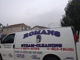
Fuente identificada: Aurilia Nurlazikana

Fuente identificada: LHF Hamilton Ornate


Looks like this, with the median spurs added manually.
Similar here:
http://www.dafont.com/judas-caps.font?text=SOURKRAUTS
Similar here:
http://www.dafont.com/judas-caps.font?text=SOURKRAUTS
Fuente sugerida: Ironwood

Thats Hydro 74s work, so could be hand lettered, but for my money, it looks based on this
Fuente sugerida: Billhead

Fuente identificada: Geared

Fuente identificada: Antique Shop

Fuente identificada: Ornamental Versals
Fuente identificada: Cooper Black

Fuente identificada: ITC Anna

According to this:
http://thewiiu.com/topic/9878-new-nintendo-logo/
it's fan made and based on Chalet NewYork
http://thewiiu.com/topic/9878-new-nintendo-logo/
it's fan made and based on Chalet NewYork
Fuente sugerida: Chalet New York

Using alternates for the 'A'??
http://www.myfonts.com/fonts/fontmesa/cowboy-western/regular/glyphs/602383/753
http://www.myfonts.com/fonts/fontmesa/cowboy-western/regular/glyphs/602383/753
Fuente sugerida: Cowboy Western

Fuente identificada: Wisdom Script

Fuente identificada: Bira

I think that's Helvetica Ultra Compressed, manually disordered.
Browse here for distorted fonts
http://www.dafont.com/theme.php?cat=108&text=1980+Portable
Browse here for distorted fonts
http://www.dafont.com/theme.php?cat=108&text=1980+Portable
Fuente sugerida: Helvetica Ultra Compressed
Heron2001 ha dicho 
Thank you Pilaster for having the old typebooks around (I lost mine in the divorce...)
Perhaps HPTFX can find an old "transfer" sheet of type - and re-create it himself.
Perhaps HPTFX can find an old "transfer" sheet of type - and re-create it himself.
I wish I had the old type books to hand. Found that image on typophile
 My old knackered memory remembered an earlier post here:
http://www.dafont.com/forum/read/47741/do-you-whta-font-is-this
The designer Rick Banks (the Face 37 link) has done a digital cut of Lubalin Graph with Alternates which he used for the St Bride Library ident, but he seems to have re-done his website and the link no longer goes to the archive page containing the work in question.

Huso horario CEST. Ahora son las 18:20
