
Foro
617 posts Fuentes identificadas Sólo solicitudes
Posts de notfon1234

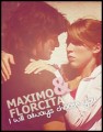
"Katy Berry", modified on the "y"...
Editado 2 veces. Última edición el 07/06/2011 a las 21:29 por rocamaco
Fuente identificada: Katy Berry
Editado 2 veces. Última edición el 07/06/2011 a las 21:29 por rocamaco

Or this one...
Editado el 07/06/2011 a las 21:10 por notfon1234
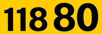
Fuente sugerida: Matrix Small Caps Book
Editado el 07/06/2011 a las 21:10 por notfon1234
srtobrunooh ha dicho 
Actually I want the font of "Effect".
sorry.. I don't know what font that is.
srtobrunooh ha dicho
No
Yes it is. look below the owl's head.

"O RLY?" (The one under the owl)
Editado el 06/06/2011 a las 22:53 por notfon1234
Fuente identificada: ITC Kabel
Editado el 06/06/2011 a las 22:53 por notfon1234

It looks a lot like Akkurat or Franklin Gothic... The E and the A are different in both.
Fuente sugerida: Akkurat Bold Italic
This looks like the one for the exceptions mentioned above.
Editado 2 veces. Última edición el 05/06/2011 a las 00:52 por notfon1234
Fuente sugerida: Monod Brun
Editado 2 veces. Última edición el 05/06/2011 a las 00:52 por notfon1234
I think they used this one for all of the letters except the "M", "E", and the "R"
Fuente sugerida: Avant Garde Bold

lothaire ha dicho
This font is from Helvetica family. They only worked on the "e" for opening the letter.
It's acctually Helvetica Neue Heavy with a modified "e"
Fuente sugerida: Helvetica Neue Heavy

Possibly modified in some areas...
Editado el 04/06/2011 a las 15:22 por notfon1234
Fuente sugerida: New Zelek
Editado el 04/06/2011 a las 15:22 por notfon1234

I think the "I Can" is Gotham Ultra but with an outline effect.
Editado 2 veces. Última edición el 04/06/2011 a las 03:54 por notfon1234
Fuente sugerida: Gotham Black
Editado 2 veces. Última edición el 04/06/2011 a las 03:54 por notfon1234

Sorry about the last post, I didn't know Futura had an Extra Black weight!
Fuente sugerida: Futura Extra Black
Fuente sugerida: Futura Bold


VERY similar but not exact. 
Editado el 31/05/2011 a las 03:28 por notfon1234

Fuente sugerida: Humanist Slabserif 721 Black
Editado el 31/05/2011 a las 03:28 por notfon1234
The ones look like Helvetica Inserat. It almost looks like it was stretched a little as well.
Editado 2 veces. Última edición el 30/05/2011 a las 17:53 por notfon1234
Fuente sugerida: Helvetica Inserat Roman
Editado 2 veces. Última edición el 30/05/2011 a las 17:53 por notfon1234
Huso horario CEST. Ahora son las 13:21
