
Foro
401 posts Fuentes identificadas Sólo solicitudes
Posts de hubris

Hewlett-Packard Personal Systems Group
Fuente identificada: HP PSG


And the rest is Typograph Pro Light.
Editado el 18/11/2011 a las 08:04 por hubris
Fuente identificada: Typograph Pro Semi Bold
Editado el 18/11/2011 a las 08:04 por hubris
Fuente identificada: Hammer Keys
Facebook uses Lucida Sans.
Edit
Well to be more precise it's:
font-family:"lucida grande",tahoma,verdana,arial,sans-serif;
Editado el 17/11/2011 a las 15:34 por hubris
Edit
Well to be more precise it's:
font-family:"lucida grande",tahoma,verdana,arial,sans-serif;
Fuente identificada: Lucida Sans
Editado el 17/11/2011 a las 15:34 por hubris

Possibly the missing "a" glyphs are modified, or just from another font.
Editado el 15/11/2011 a las 16:52 por hubris
Fuente identificada: Cafe Lounge 19
Editado el 15/11/2011 a las 16:52 por hubris


Fuente identificada: Avenir Black

Fuente sugerida: SF Distant Galaxy (Ya se ha sugerido aquí)
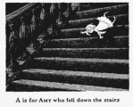
I'm quite certain that Edward Gorey (RIP) hand wrote The Ghastlycrumb Tinies.
However, I did come across a font based on his lettering.
EDIT
The capital M in the font is definitely different from his writing.
I still think it was hand lettered, the letters are well done but they do vary.
http://www.joeclipart.com/blog/images/2011/02/20110208gorey-amy.jpg
Editado el 14/11/2011 a las 23:53 por hubris
However, I did come across a font based on his lettering.
EDIT
The capital M in the font is definitely different from his writing.
I still think it was hand lettered, the letters are well done but they do vary.
http://www.joeclipart.com/blog/images/2011/02/20110208gorey-amy.jpg
Fuente sugerida: Gorey
Editado el 14/11/2011 a las 23:53 por hubris

Fuente identificada: Brush Script
Fuente identificada: Algerian
Editado 2 veces. Última edición el 09/11/2011 a las 18:18 por rocamaco

Fuente identificada: Magneto Bold
Fuente sugerida: Bryant Light Compressed

Fuente identificada: Big Caslon CC

Antenna Comp Medium
Looks like they've squished it horizontally a bit.
EDIT
Scratch that, the G is completely different.
Editado el 08/11/2011 a las 17:38 por hubris
Looks like they've squished it horizontally a bit.
EDIT
Scratch that, the G is completely different.
Fuente sugerida: Antenna Comp Medium
Editado el 08/11/2011 a las 17:38 por hubris
Fuente identificada: Paradise Script One

"LANCHE" looks a lot like a slightly skinny Lithograph (which it could just be the yellow stroke making it look skinny)
lithograph should come with your computer but I'll send a link.
(also, total ripoff of Banjo Kazooie title)
lithograph should come with your computer but I'll send a link.
(also, total ripoff of Banjo Kazooie title)
Fuente identificada: Lithos Pro Bold

Fuente identificada: Balloon Extra Bold
Huso horario CEST. Ahora son las 23:04
