
Foro
119 posts Fuentes identificadas Sólo solicitudes
Posts de logistics

@timesnewroman thank you. it looks like a mixture of Chalet New York Nineteen Seventy and Chalet New York Nineteen Sixty. Very strange I'd never expect a designer to mix fonts in the same word
Editado el 13/05/2024 a las 01:15 por frd
Editado el 13/05/2024 a las 01:15 por frd
Anybody?
It's close, but the 'a' and 'o' are different. Also 'r' hangs lower in Amelia
Any idea on SHIRA KASHI font?
Any idea on SHIRA KASHI font?
please help with pro mark and SHIRA KASHI OAK fonts
pro mark looks like Yellow Submarine but the a and r are different.

pro mark looks like Yellow Submarine but the a and r are different.

Fuente sugerida: News Gothic


Fuente sugerida: Runic


Fuente identificada: Eurostile
Fuente sugerida: Highwind

Fuente identificada: Times Bold Italic

Fuente identificada: Helvetica Bold
Very likely not a font


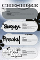
Fuente identificada: Brighly Crush

Fuente sugerida: Molde Expanded

Huso horario CEST. Ahora son las 23:01
