
Foro
3.821 posts Fuentes identificadas
Posts de donshottype


This style of type is a faux-chinese or "chop suey font" -- a US concept of China that began in 1883, when the Cleveland Type Foundry created a typeface called Chinese Wong, which became known as Mandarin by the mid 1950s. There are many versions under various names.
The closest match to _NUMANI_ that I found so far is China Doll JL, based on a Speedball lettering book published in 1960.
I should note that some people criticize the use of these fonts as promoting racism or stereotyping. Link to an article with this view http://magazine.good.is/articles/how-chop-suey-fonts-sell-a-fictional-china
Editado el 31/07/2015 a las 11:13 por donshottype
The closest match to _NUMANI_ that I found so far is China Doll JL, based on a Speedball lettering book published in 1960.
I should note that some people criticize the use of these fonts as promoting racism or stereotyping.
 Link to an article with this view http://magazine.good.is/articles/how-chop-suey-fonts-sell-a-fictional-china
Fuente sugerida: China Doll
Editado el 31/07/2015 a las 11:13 por donshottype

If I recall correctly, at least one of these fonts, Lousianne, is a pirated copy of the digital outlines in Salut, which was designed by Heinrich Johannes Maehler and is published by Monotype
Intellectual property law some countries, if I understand it correctly, does not prohibit making digital fonts based on printed specimens -- I do it my self -- but does make it illegal to copy the digital outlines of in a published font, which are protected as computer software.
Don
Intellectual property law some countries, if I understand it correctly, does not prohibit making digital fonts based on printed specimens -- I do it my self -- but does make it illegal to copy the digital outlines of in a published font, which are protected as computer software.
Don
Fuente sugerida: Salut
Available with some Apple products: Textile
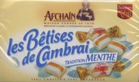
I am not certain which of my suggestions is closest to _les Bêtises de Cambrai_ but I hope one works for you as a substitute.
Don
I am not certain which of my suggestions is closest to _les Bêtises de Cambrai_ but I hope one works for you as a substitute.
Don
Fuente sugerida: Textile

Fuente identificada: Desdemona

Fuente identificada: Copasetic
Lining Livermore: Link to most of the alphabet, in test words, from an attempt at recreation of Lining Livermore http://thelawlers.com/Blognosticator/wp-content/uploads/2014/07/Annunciation-Brevity.jpg Discussion at http://thelawlers.com/Blognosticator/?p=1747
Don
Don

_Rund Gas..._ is Lining Livermore. AFAIK not digitized .Link to a specimen excerpted from the American Specimen Book of Type Styles (1912), by the American Type Founders Company
http://www.talkgraphics.com/attachment.php?s=1be1f69157db28994b3447342993f326&attachmentid=88833&d=1334624595
https://archive.org/stream/americanspecimen00amerrich#page/846/mode/2up
Don
Editado 2 veces. Última edición el 29/07/2015 a las 14:52 por drf
http://www.talkgraphics.com/attachment.php?s=1be1f69157db28994b3447342993f326&attachmentid=88833&d=1334624595
https://archive.org/stream/americanspecimen00amerrich#page/846/mode/2up
Don
Fuente sugerida: Lining Livermore
Editado 2 veces. Última edición el 29/07/2015 a las 14:52 por drf
_Practical Sanitary ... Tubs ... Closets ...._ is all in the ATF font named after William H. Bradley, digitized by Ralph M. Unger
Don
Don
Fuente sugerida: Bradley
Comparing Zrnic to _raider_
* has sharp instead of curved corners on lower rhs of _a_ and _d_
* letters are wider than _raider_
* thickness of vertical stroke of Zrinc Bold looks about the same as _raider_
* thickness of horizontal stroke of Zrinc Regular looks about the same as _raider_
* length of clipped stroke circling counter is much shorter than _raider_
However, Zrnic Bold and Regular could be combined and edited to make a version of _raider_
I have seen nothing closer.
Don
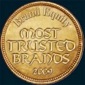
The _M_ and _N_ in _MOST TRUSTED BRANDS_ have some similarity to Clairvaux
Don
Don
Fuente sugerida: Clairvaux
Also digitized by Andreas Seidel [without mention of the source]
Don
Editado 2 veces. Última edición el 28/07/2015 a las 19:35 por donshottype
Don
Fuente sugerida: Simeon
Editado 2 veces. Última edición el 28/07/2015 a las 19:35 por donshottype
In my opinion _MOST TRUSTED BRANDS_ is probably lettering derived mainly from Günter Gerhard Lange's Solemnis of 1953.
Digitized by Berthold
Don
Editado 2 veces. Última edición el 28/07/2015 a las 19:35 por donshottype
Digitized by Berthold
Don
Fuente sugerida: Solemnis
Editado 2 veces. Última edición el 28/07/2015 a las 19:35 por donshottype
Roc Mitchell digitization of 1999 was once available.
See link in conman1985's post of Sept 8, 2014 in http://www.dafont.com/forum/read/167772/nintendo-entertainment-system-not-regular-nintendo-font
Don
See link in conman1985's post of Sept 8, 2014 in http://www.dafont.com/forum/read/167772/nintendo-entertainment-system-not-regular-nintendo-font
Don
Huso horario CEST. Ahora son las 21:46
