
Foro
1.577 fuente identificadas Todos los posts Sólo solicitudes
Fuentes identificadas por Hondo5834

Fuente identificada: XBall

Fuente identificada: Blair Bold

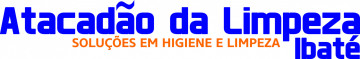
Fuente identificada: Adam Warren Pro

It's stretched.
Fuente identificada: Master of Break

Fuente identificada: Titan One

Fuente identificada: Agincourt

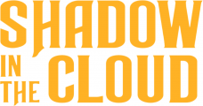
Fuente identificada: Luckiest Guy

Fuente identificada: Run!


Fuente identificada: Taken By Vultures


Fuente identificada: Ravenholm Bold

Fuente identificada: Calibri


Fuente identificada: Bourbon St

Fuente identificada: Danube
Fuente identificada: Helvetica Bold
Huso horario CEST. Ahora son las 14:41
