
Foro
416 fuente identificadas Todos los posts Sólo solicitudes
Fuentes identificadas por Chronos


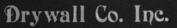
Fuente identificada: Powerhouse Era

Fuente identificada: Cheap Potatoes Black

Fuente identificada: Rysky Lines

Looks like Handel Gothic with the "R" modified - shrug.
Editado el 02/08/2014 a las 16:48 por drf
Fuente identificada: Handel Gothic
Editado el 02/08/2014 a las 16:48 por drf

Fuente identificada: Raphael

Fuente identificada: Kids

Fuente identificada: A Gentle Touch

Fuente identificada: Pahuenga Cass

Fuente identificada: Gemina Laser

Fuente identificada: Helvetica

Palatino Light
*The squished "INNER CITY" is poor design; it should not be forced when it's placed right next to the same lettering that is not forced.
*The squished "INNER CITY" is poor design; it should not be forced when it's placed right next to the same lettering that is not forced.
Fuente identificada: Palatino Light


Fuente identificada: Serifa
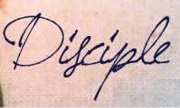
Fuente identificada: Jellyka BeesAntique Handwriting
Fuente identificada: Conduit Bold

Fuente identificada: Chowderhead

Fuente identificada: Bolivar
Fuente identificada: American Captain

Fuente identificada: XmasTerpiece
Huso horario CEST. Ahora son las 15:03
