
Foro
6.105 fuente identificadas Todos los posts Sólo solicitudes
Fuentes identificadas por Heron2001


Fuente identificada: Helvetica Neue 63 Ext Medium
Editado 2 veces. Última edición el 17/11/2014 a las 10:38 por drf
Fuente identificada: Zombie
Fuente identificada: Windsor Elongated


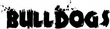
Fuente identificada: Blambot Casual


There was a font called LHF Jami - LHF stands for Letterhead Fonts - but it is not available on their site.
Fuente identificada: LHF Jami


It's the capital S (not a 5)
Editado el 12/11/2014 a las 19:29 por Heron2001
Fuente identificada: Vhia
Editado el 12/11/2014 a las 19:29 por Heron2001
Fuente identificada: Pepsi

Sorry, I don't look for symbols... but the Wide Eyed Legless is in Josephin Sans - probably in the Light 300 weight.
Fuente identificada: Josefin Sans


It's an old OptiFont Triplett Agency font in bold
Fuente identificada: Triplett Agency
Huso horario CEST. Ahora son las 02:12
