
Foro
4.482 fuente identificadas Todos los posts
Fuentes identificadas por SashiX

Fuente identificada: Short Stack

Fuente identificada: Optima Bold

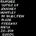
Fuente identificada: Arsenale White

Fuente identificada: Masque


Fuente identificada: Strangelove
Fuente identificada: Eraser Dust


Mmm... not Proxima, at least for me  Take a look at middle part of "E" and "F", the middle "-" part is not in the middle, those "E" and "F" has Futura/Century Gothic style.
EDIT: LOL, and without the microscope http://i3.photobucket.com/albums/y57/cyberlawprof/Watches/IMG_8915poster.jpg
Editado el 11/05/2012 a las 18:57 por SashiX
 Take a look at middle part of "E" and "F", the middle "-" part is not in the middle, those "E" and "F" has Futura/Century Gothic style.
EDIT: LOL, and without the microscope
 http://i3.photobucket.com/albums/y57/cyberlawprof/Watches/IMG_8915poster.jpg
Fuente identificada: Century Gothic
Editado el 11/05/2012 a las 18:57 por SashiX

or Square 721 Bold Extended (difficult to say which one exactly)
Fuente identificada: Eurostile Ext Black

Fuente identificada: Eras Demi
japan font @12 pix (should come with Win)
Fuente identificada: MS Mincho

Fuente identificada: Bistro Script
Fuente identificada: You Are Loved


Fuente identificada: Peach Sundress

Fuente identificada: Microgramma

Fuente identificada: Skin & Bones
Huso horario CEST. Ahora son las 14:24
