
Foro
6.105 fuente identificadas Todos los posts Sólo solicitudes
Fuentes identificadas por Heron2001


Fuente identificada: CA Wolkenfluff Stencil
Fuente identificada: Platform

Fuente identificada: Antonio

Fuente identificada: Deco Roman

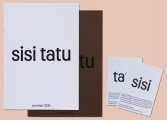
Fuente identificada: Spring

Fuente identificada: Brisk

Fuente identificada: Antro Vectra

Fuente identificada: DK Spaghetti And Cheese


Fuente identificada: Korinna

Handyman looks like it was set in Letterhead's Samster Script, which is no longer available from them.
KEENLY also looks like a font that would have been from Letterhead. But I can't find it, sorry.
I take it back - Samster was renamed Signkit...
Editado 2 veces. Última edición el 21/06/2018 a las 16:14 por Heron2001
KEENLY also looks like a font that would have been from Letterhead. But I can't find it, sorry.
I take it back - Samster was renamed Signkit...
Fuente identificada: Signkit Script
Editado 2 veces. Última edición el 21/06/2018 a las 16:14 por Heron2001


Fuente identificada: The Blacklist

The L -is a glyph from open type - and I cannot show it here, but you'll see it if you look at the glyphs.
This was set in Bold
This was set in Bold
Fuente identificada: Minion

I knew this as URW Block - but it doesn't seem available anymore. I did find Bloc by Paratype - take a look.
Fuente identificada: Bloc

You can test it out here: https://try.typography.com/?font=100013
If you cannot afford a Hoefler, Frere & Jones font - you may want to consider an alternative -
Equal Sans (and thin it out) https://www.dafont.com/equal-sans-demo.font?text=SAFE&psize=l
If you cannot afford a Hoefler, Frere & Jones font - you may want to consider an alternative -
Equal Sans (and thin it out) https://www.dafont.com/equal-sans-demo.font?text=SAFE&psize=l
Fuente identificada: Knockout 27
Huso horario CEST. Ahora son las 15:56
