
Foro
2 posts
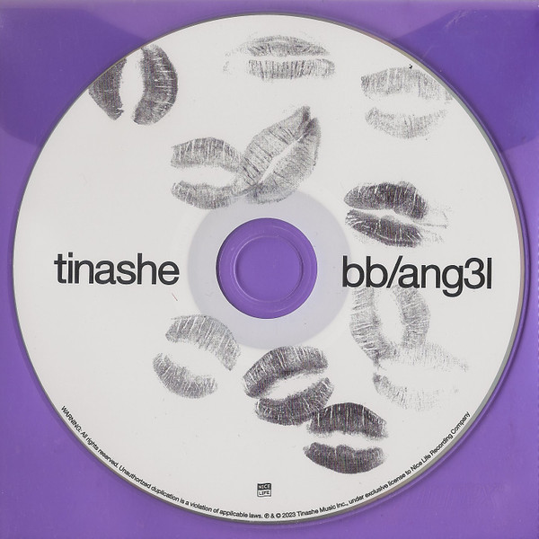
tinashe bb/ang3l helvetica font variant?
Hi, wanna look for the variant of Helvetica Neue or any Grotesque font that has consistent line thickness in the letter 'a' and 'h' like this picture below. I looked using whatthefont and found some that looked almost identical like Salame, Vatik or Vetrena but for those the letter 't' doesn't look right (the extra length in the tail of the 't' character).
Europa Grotesk No. 2 Sugerido por Hondo5834
Fuente sugerida
Europa Grotesk No. 2 Sugerido por Hondo5834

Fuente sugerida: Europa Grotesk No. 2
Huso horario CEST. Ahora son las 09:04
