
Foro
3 posts
Whats that font?
I remember this from a PS1 Game in the late 90s
Could also be an intro from a publisher or something
I think it was Konami and the word / font appeared from top to bottom.
But I'm not sure it was a long time ago.
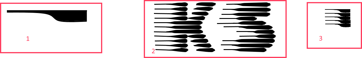
The logo did not look exactly like in the picture,
I took a font from the internet and edited it with paint (Red box 2)
The thin stripes were placed more on top of the thick stripes
The individual links of the letter looked like in red box 1
In box 3 you can see an example of part of a letter.
I'm thankful for every hint 🙂
Slipstream Sugerido por Heron2001
Could also be an intro from a publisher or something
I think it was Konami and the word / font appeared from top to bottom.
But I'm not sure it was a long time ago.
The logo did not look exactly like in the picture,
I took a font from the internet and edited it with paint (Red box 2)
The thin stripes were placed more on top of the thick stripes
The individual links of the letter looked like in red box 1
In box 3 you can see an example of part of a letter.
I'm thankful for every hint 🙂
Fuente sugerida
Slipstream Sugerido por Heron2001

Similar only
Fuente sugerida: Slipstream

If the lines ran from top to bottom the #2 image reminds me of Lamina Don, a dry transfer font from Mecanorma. See https://creativemarket.com/dosdiez/2038356-Mandolina
Huso horario CEST. Ahora son las 02:08
