Foro
4 posts
What font is this??
In 1977, when this Star Wars pyramid logo was designed, there was no font that would be the obvious inspiration for the letters, although there was apparently a predigital Jay Gothic Extra Bold that had some similarities.
A recently released font [in 2014], Teko Bold, is closer, but is NOT THE FONT.
A recently released font [in 2014], Teko Bold, is closer, but is NOT THE FONT.
Fuente sugerida: Teko Bold
just google for "star wars font" there is thousands copies
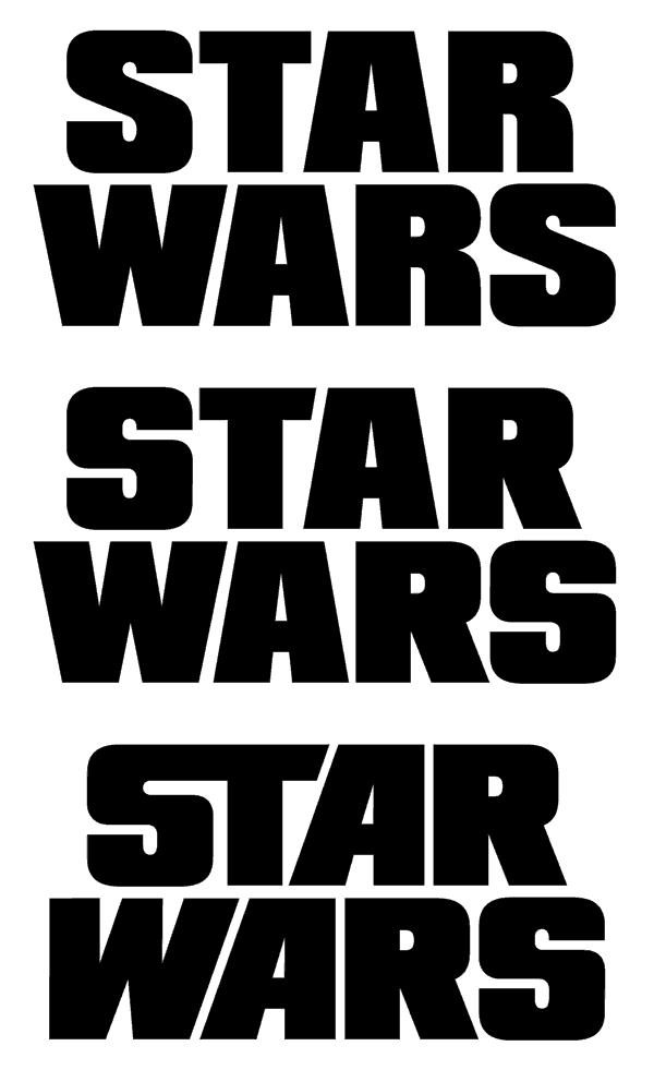
Nope. It's custom lettering by Dan Perri, drawn in a vanishing point perspective and intended for the opening crawl of the 1977 film. I can say that Futura Display and Compacta Black were seemingly used in some of the other marketing for Star Wars, including some of the international logos drawn to match the style of Perri's logo. Whether or not those exact typefaces were the basis for Perri's original logo is not discernible. Below is an example of how it could have been done.
Possible Compacta Black modification demo:

Editado el 07/12/2021 a las 07:53 por frd
Possible Compacta Black modification demo:

Editado el 07/12/2021 a las 07:53 por frd
Huso horario CEST. Ahora son las 01:14


