Anzeige von ingoFonts
Fundstueck
in Techno > Quadratisch
1.206 Downloads (1 gestern) 100% Kostenlos - 2 Font-Dateien
Fundstueck.ttfAnmerkung des Autors
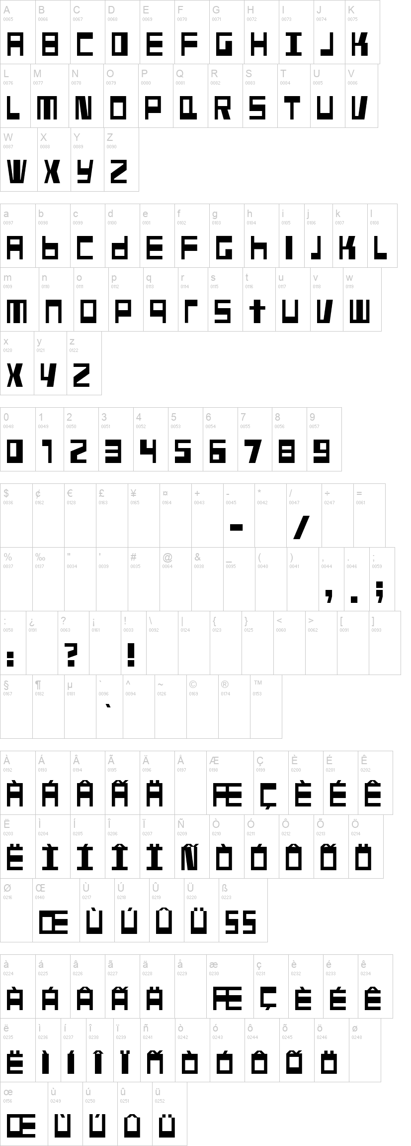
Inspired by a rusty piece of metal, a coarse but decorative font was created.
Fonts can be so simple. That is what I was thinking as my attention was turned to this rusty piece of metal. Only a few centimeters in size, I couldn’t imagine which purpose it might truly serve. But my eyes also saw an E, even a well-proportioned E: a width to height ratio of approximately 2/3, black and fine strokes with a 1/2 proportion — could I create more characters on this basis?
Thought it, did it. The form is based on a 5mm unit.
The strikingly thick middle stroke of E suggests that the emphasis is not necessarily placed on the typical stroke, and likewise with the other characters. But if the font is going to be somewhat legible, then you cannot leave out slanted strokes completely. Eventually I found enough varying solutions for all letters of the alphabet and figures.
A font designed in this way doesn’t really have to be extremely legible, which is why I forwent creating lower case letters.
Nevertheless, Fundstueck still contains some diverse forms in the layout of upper and lower case letters. Thus, the typeface is a bit richer in variety.
Fundstueck includes only the alphabet and the usual Western European accents (without the Scandinavian).
Only the most necessary punctuation is included.
By the way — the “lower” letters with accents and umlauts stay between the baseline and cap height. And with that, you get wonderful ribbon-type lines.
Zuerst auf DaFont erschienen: 19.09.2022