
Forum
8 posts Identifizierte Fonts
Posts von elements_at
try Znikomit. it looks very close, but the funny extensions seem not to be part of the font. this seems to be selfconstructed.
Vorgeschlagener Font: Znikomit
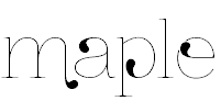
there exist nearly endless variations of gothic typos, especially cause this typo was handwritten. when its from an 50 year old car, perhaps it was especially designed for it.
at the gothic/medieval section of dafont, you will find a lot of similar fonts.
Bearbeitet am 29.12.2011 um 16:17 von koeiekat
at the gothic/medieval section of dafont, you will find a lot of similar fonts.
Bearbeitet am 29.12.2011 um 16:17 von koeiekat
the edges make it look self constructed. not every typo is available :(

Identifizierter Font: Candara
It's not Times New Roman. You can see it very good, if you compare the g of the word "Negro" with the g of TNR. This font has also more compact serifs.

Vorgeschlagener Font: Chaparral Pro (Bereits vorgeschlagen hier)
as you can see at the R and the the bow of the A, this is no regular font. it looks, as if a basic serif font was adapted for this setting. don't expect to find this font for your work.

Identifizierter Font: Industria Solid
Bearbeitet am 28.12.2011 um 14:53 von drf_
Alle Zeitangaben sind CET. Es ist jetzt 12:07
