
Forum
3.821 posts Identifizierte Fonts
Posts von donshottype


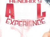
Because this is a brand logo you can expect some customization, such as the oval counter of _a_
Looks like they started with a heavy font and condensed the width by perhaps 50 percent.
Here are some substitutes, consisting of fonts with the width at 50 percent
Frutiger UltraBlack

FreeSet Extra Bold [based on Frutiger]

Interval Sans CondBlack

Kyrial Sans CondBlack

Myriad CondBlack

Bearbeitet am 22.08.2016 um 16:22 von frd
Looks like they started with a heavy font and condensed the width by perhaps 50 percent.
Here are some substitutes, consisting of fonts with the width at 50 percent
Frutiger UltraBlack
FreeSet Extra Bold [based on Frutiger]
Interval Sans CondBlack
Kyrial Sans CondBlack
Myriad CondBlack
Vorgeschlagener Font: Frutiger
Bearbeitet am 22.08.2016 um 16:22 von frd

Identifizierter Font: Neil Bold
Identifizierter Font: Gyparody

Identifizierter Font: Zipper

Vorgeschlagener Font: Art Gothic

Identifizierter Font: Futura Condensed ExtraBold

Identifizierter Font: Gang of Three

Hand-lettered from the era.
Closest _R_ is in Eckhardt Titling JNL
Also look at Eckhardt Sans JNL
http://myfonts.us/td-amnAUm
As well as Futura Medium
http://myfonts.us/td-elkrnZ
Closest _R_ is in Eckhardt Titling JNL
Also look at Eckhardt Sans JNL
http://myfonts.us/td-amnAUm
As well as Futura Medium
http://myfonts.us/td-elkrnZ
Vorgeschlagener Font: Eckhardt Titling

The hairline didone with the unique ball terminal _C_
Bearbeitet am 18.08.2016 um 21:23 von donshottype
Vorgeschlagener Font: Estrella Hairline
Bearbeitet am 18.08.2016 um 21:23 von donshottype

I don't know if this is lettering or an available font, but it is derived from the bold weight of Robert Wiebking's Engravers Roman
Vorgeschlagener Font: Engravers Bold
On second thought Akzidenz-Grotesk Bold http://myfonts.us/td-stik45 is almost certainly the source for something called _Agust D_
Echte Deutsche
Bearbeitet am 18.08.2016 um 01:58 von donshottype
Echte Deutsche

Bearbeitet am 18.08.2016 um 01:58 von donshottype
I enhanced the lettering so it looks like this

looks sort of familiar but I haven't been able to find a match
looks sort of familiar but I haven't been able to find a match


Identifizierter Font: Hessian

Custom nameplate logo, apparently with no matching font, but derived from Clarendon Black
Vorgeschlagener Font: Clarendon Black

I don't see an exact match for all of the letters.
According to their website
http://home.cfmiami.com/
they have a toll free number 1-800-877-4065
It is possible they would provide some info on the making of the logo.
Several similar fonts including Handel Gothic and CA Aircona. They are NOT THE FONT
According to their website
http://home.cfmiami.com/
they have a toll free number 1-800-877-4065
It is possible they would provide some info on the making of the logo.
Several similar fonts including Handel Gothic and CA Aircona. They are NOT THE FONT
Vorgeschlagener Font: Aircona

I choose Basic Commercial Black over Akzidenz-Grotesk Bold but as far as I can see these letters are the same in both fonts.
See for yourself http://myfonts.us/td-stik45
See also Gothic 725 Black http://myfonts.us/td-tcBskh
Bearbeitet 2 mal. Zuletzt bearbeitet am 17.08.2016 um 09:17 von donshottype
See for yourself http://myfonts.us/td-stik45
See also Gothic 725 Black http://myfonts.us/td-tcBskh
Vorgeschlagener Font: Basic Commercial Black
Bearbeitet 2 mal. Zuletzt bearbeitet am 17.08.2016 um 09:17 von donshottype

If you prefer a different weight or width, an assortment is available at MyFonts
http://myfonts.us/td-P8uoen
Bearbeitet am 17.08.2016 um 08:45 von donshottype
http://myfonts.us/td-P8uoen
Identifizierter Font: Chinese Rocks
Bearbeitet am 17.08.2016 um 08:45 von donshottype
Good find Jersygirl!
Further info from Mac McGrew, author of American Metal Typefaces of the 20th Century:
---start quote---
Hess Neobold was designed by Sol Hess for Monotype in 1934. It is a narrow, bold, and very squarish gothic with small serifs, designed for attention-getting display in a style of the day, but never made in more than one size. Compare Airport Tourist (Futura Display), Othello.
---end quote--
So, designed by a master type designer


Not certain if this is a font or lettering.
Futura Display Compressed has a similar weight, height to width ratio, and similar shapes for most of the letters, but lacks the tiny Copperplate Gothic style serifs.
Futura Display Compressed has a similar weight, height to width ratio, and similar shapes for most of the letters, but lacks the tiny Copperplate Gothic style serifs.
Vorgeschlagener Font: Futura Display Compress
Alle Zeitangaben sind CEST. Es ist jetzt 11:04
