
Forum
3.821 posts Identifizierte Fonts
Posts von donshottype


Gotham Black edited to make tri-line letters.
p.s. On second thought, it looks more like Gotham Ultra
Vorgeschlagener Font: Gotham
Bearbeitet 2 mal. Zuletzt bearbeitet am 20.09.2016 um 23:03 von donshottype
I agree. It's really frustrating when one attempts to Myfonts permalink to a font with many variations such as Linotype's Helvetica and the permalink produces pangrams. 


My fonts permalink preview chokes on _&_
Here is the _&_
http://www.myfonts.com/fonts/linotype/handel-gothic/com-medium/glyphs.html#glyphs/528473/8
Bearbeitet am 20.09.2016 um 21:22 von donshottype
Here is the _&_
http://www.myfonts.com/fonts/linotype/handel-gothic/com-medium/glyphs.html#glyphs/528473/8
Bearbeitet am 20.09.2016 um 21:22 von donshottype

Identifizierter Font: Handel Gothic

Other names: Invers SF (1990 Brendel Informatik/SoftMaker), OPTI Iambic (1990-1991 Castcraft Software), Speedway (1990-1992 FontBank), Concorde (1994 Brendel Informatik), Galaxy (1986-1995 SWFTE), Inverserif (2002 SoftMaker)
No way of knowing which one was used to make _1up_
No way of knowing which one was used to make _1up_

Vorgeschlagener Font: Filmotype Honey

Audio is El Greco, designed by G.G. Lange for Berthold in 1964

Berthold digitized El Greco http://www.myfonts.com/fonts/berthold/el-greco-pro/ but dropped the swash from _A_. However, Berthold kept the swash for the _A_ portion of the _AE_ ligature http://www.myfonts.com/fonts/berthold/el-greco-pro/regular/glyphs.html#glyphs/439008/142 This swash could be pasted on _A_ to recreate the pre-digital _A_
Berthold digitized El Greco http://www.myfonts.com/fonts/berthold/el-greco-pro/ but dropped the swash from _A_. However, Berthold kept the swash for the _A_ portion of the _AE_ ligature http://www.myfonts.com/fonts/berthold/el-greco-pro/regular/glyphs.html#glyphs/439008/142 This swash could be pasted on _A_ to recreate the pre-digital _A_
Identifizierter Font: El Greco
Identifizierter Font: Eras Ultra
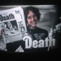
Phototype era Thalia squished on newspaper and stretched on TV screen
Originally published by Schelter & Giesecke before WWI
Digital recreation by Ralph M. Unger
Originally published by Schelter & Giesecke before WWI
Digital recreation by Ralph M. Unger
Vorgeschlagener Font: Thalia

@jerseygirl Good find
Agree with Calibre Black. I find no differences from SAMPLEKOR in the image
Agree with Calibre Black. I find no differences from SAMPLEKOR in the image


Acronym ExtraBlack is closer
Most people would not notice the differences.
Bearbeitet am 19.09.2016 um 18:03 von donshottype
Most people would not notice the differences.
Vorgeschlagener Font: Acronym ExtraBlack
Bearbeitet am 19.09.2016 um 18:03 von donshottype
Solanel Black is as close as I have found so far.
A fair match but not heavy enough.
Still looking.
A fair match but not heavy enough.
Still looking.
Vorgeschlagener Font: Solanel Black
Columbia Serial, the version of Optima produced by Softmaker. Note the angular acute accent, which is not found in the versions of Optima by other foundries.
Note the width of the period is horizontally compressed to somewhere between 70 and 80 percent of its height. The uncompressed text matches of Columbia Serial Heavy
Bearbeitet am 19.09.2016 um 12:09 von donshottype
Note the width of the period is horizontally compressed to somewhere between 70 and 80 percent of its height. The uncompressed text matches of Columbia Serial Heavy
Vorgeschlagener Font: Columbia Serial Heavy
Bearbeitet am 19.09.2016 um 12:09 von donshottype
Higher resolution image of this 1876 book cover

Embossed lettering not based directly on specific fonts.
The words _THE MOON_ are similar to an 1876 font called Lacrosse -- note the hooked terminals on _H_, _M_ and _N_ which resemble Lacrosse sport sticks. AFAIK no digital.
Embossed lettering not based directly on specific fonts.
The words _THE MOON_ are similar to an 1876 font called Lacrosse -- note the hooked terminals on _H_, _M_ and _N_ which resemble Lacrosse sport sticks. AFAIK no digital.
Logo in the "handmade" style, either for a real company or as an art project.
A search did not uncover a matching font.
The _S_, without the spurs, is similar to the _S_ in any of the various fonts based on U.S. Interstate Highway signage.
A free version, Hit the Road, is available here at Dafont.
http://www.dafont.com/hit-the-road.font?text=SIBERIA
Paste on some spurs and you have a fair substitute

Make some adjustments to the letters, such as raising the midline in _B_, _E_ and _R_ and the substitute is closer to SIBERIA.
A search did not uncover a matching font.
The _S_, without the spurs, is similar to the _S_ in any of the various fonts based on U.S. Interstate Highway signage.
A free version, Hit the Road, is available here at Dafont.
http://www.dafont.com/hit-the-road.font?text=SIBERIA
Paste on some spurs and you have a fair substitute
Make some adjustments to the letters, such as raising the midline in _B_, _E_ and _R_ and the substitute is closer to SIBERIA.
Based on the style of _o_ I would call these soft blackletter letters a fraktur.
The Roman style _k_, the recognizable _x_ and the use of a short rather than long _s_ in the middle of a word suggests that it might be a modern design.
It would be helpful if you could mention where you found the letters.
Are they a logo?
The Roman style _k_, the recognizable _x_ and the use of a short rather than long _s_ in the middle of a word suggests that it might be a modern design.
It would be helpful if you could mention where you found the letters.
Are they a logo?

Use the Bitstream version. The other versions are not an exact match.
Identifizierter Font: Thunderbird
Alle Zeitangaben sind CEST. Es ist jetzt 08:59
