
Forum
13.584 posts Identifizierte Fonts Nur Anfragen
Posts von Heron2001

Juan, por favor, comprenda - sólo un "bache" por 24 horas. Todos somos voluntarios y tienes que esperar a que alguien reconozca la fuente.
Juan, please understand - only one "bump" per 24 hours. We are all volunteers and you must wait for someone to recognize the font.
Juan, please understand - only one "bump" per 24 hours. We are all volunteers and you must wait for someone to recognize the font.
Rocamaco - my eyes may not be as good as they once were - but the letters you show in that thread - has a different E then the sample from above.
I know that there is a Neutraface Display that has an alternative "G" - but not sure if it an exact match to the sample - but it is most definitely closer to the G shown here, then the G in the regular display face.
I know that there is a Neutraface Display that has an alternative "G" - but not sure if it an exact match to the sample - but it is most definitely closer to the G shown here, then the G in the regular display face.

It looks like Eagle Book to me... but my eyes are not the same as they once were...
Vorgeschlagener Font: Eagle Book
NOT THE FONT but similar would be
Sugar Pie http://myfonts.us/td-fvyItJ - using alternatives: http://www.myfonts.com/fonts/sudtipos/sugar-pie/sugar-pie/glyphs.html
and in some ways it is also similar to Calgary Script http://myfonts.us/td-37GP1d but you'd be better off with Sugar Pie...
Sugar Pie http://myfonts.us/td-fvyItJ - using alternatives: http://www.myfonts.com/fonts/sudtipos/sugar-pie/sugar-pie/glyphs.html
and in some ways it is also similar to Calgary Script http://myfonts.us/td-37GP1d but you'd be better off with Sugar Pie...

It looks a lot like ITC Arid - made solid and with an extended bar across the "T"
Vorgeschlagener Font: ITC Arid
I wish I could tell you the name - but I do not know this font. However, if you are looking for something close take a peek at Changling Neo Inline
IT'S NOT THE FONT FOLKS - just an alternate suggestion.
IT'S NOT THE FONT FOLKS - just an alternate suggestion.
Vorgeschlagener Font: Changeling Neo Inline

Vorgeschlagener Font: Bodoni Bold
Vorgeschlagener Font: Neutraface Display Titling

If you would like to have something "SIMILAR" - BUT it is not the same...
Look at Smudger
I know it's not the font - just an alternative
(and there is not font for this because a designer handlettered it.)
Look at Smudger
I know it's not the font - just an alternative
(and there is not font for this because a designer handlettered it.)
Vorgeschlagener Font: Smudger
You may want to read an earlier post from another site about this
http://typophile.com/node/34019
A font that comes close is Speedline
http://typophile.com/node/34019
A font that comes close is Speedline
Vorgeschlagener Font: Speedline
As you can see - I am not sure if this is or isn't a font... I'm only offering alternatives. I know when I have a project and the font is unknown, I go for what I can and pray the client is okay with it - and you know, they normally are and the work gets done.


and if you would like to splurge on a commercial font - Monotype's Synthetica is very close.
Vorgeschlagener Font: Synthetica Bold
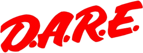
I don't think this is a font - after looking it over - your two "L"s do not match. There are some fonts that are similar - but NOT THE SAME... (I do that for the folks that can't read or comprehend that I am not giving you an exact font.)
On Dafont.com you can find -
Brushtip Travis: http://www.dafont.com/brushtiptravis.font?fpp=500&psize=l&text=Rally
Brushtip Terrence: http://www.dafont.com/brush-tipterrence.font?fpp=500&psize=l&text=Rally
Curly Joe: http://www.dafont.com/curlyjoe.font?fpp=500&psize=l&text=Rally
maybe one of these will be an acceptable substitute.
Vorgeschlagener Font: 911 Porscha
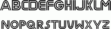
Identifizierter Font: ITC Avant Garde

Your image looks like the letter is on a cloth - which distorts it... it may have been Livery Stable when it was first silk screened.
If you are looking for something similar from dafont.com - take a peek at Intellecta Bodoned Two
http://www.dafont.com/intellectabodoned-two.font?text=e
If you are looking for something similar from dafont.com - take a peek at Intellecta Bodoned Two
http://www.dafont.com/intellectabodoned-two.font?text=e
Vorgeschlagener Font: Livery Stable

I wonder if this really is a font - or if perhaps it is a signature from Alexis.
If you are looking for something similar
(BUT NOT THE SAME folks who like to say it isn't a match - I know, I know)
you may want to play mix and match from Zapfino Extra.
If you are looking for something similar
(BUT NOT THE SAME folks who like to say it isn't a match - I know, I know)
you may want to play mix and match from Zapfino Extra.
Vorgeschlagener Font: Zapfino Extra
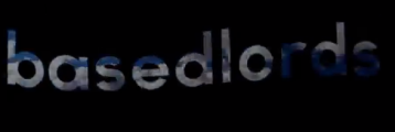
Not sure but you could try (and I can't see beyond the L as to what the other letters are....)
Century Gothic Bold: http://myfonts.us/td-OLeU6y
But I think it may be Neutraface Bold Alternative
Century Gothic Bold: http://myfonts.us/td-OLeU6y
But I think it may be Neutraface Bold Alternative
Vorgeschlagener Font: Neutraface Bold Alternative
Alle Zeitangaben sind CEST. Es ist jetzt 14:05
