
Forum
1.396 posts Identifizierte Fonts Nur Anfragen
Posts von gonfer00

It's not a font. Each E is different. Also the O's are different.

"Chasing cars", great song
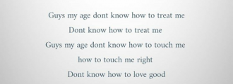
The font look like Courier italic, but the w is different
The font look like Courier italic, but the w is different
Inspecting this PD: https://canal1.com.co/wp-content/themes/canal-uno/mediakit.pdf
we can see that it is indeed Neo Sans (or, more precisely, appears as NeoSans1). Perhaps the alternate a's are the unslanted italic versions.
we can see that it is indeed Neo Sans (or, more precisely, appears as NeoSans1). Perhaps the alternate a's are the unslanted italic versions.


I's ay that is a modification of Neuzeit Office Rounded
Vorgeschlagener Font: Neuzeit Office Soft Rounded Pro

MAGS
Bearbeitet am 11.06.2018 um 02:23 von Lemmiwinks
Identifizierter Font: Eurostile Bold Extended #2
Bearbeitet am 11.06.2018 um 02:23 von Lemmiwinks

Vorgeschlagener Font: Difot Headline Bold
Vorgeschlagener Font: Bank Gothic

Identifizierter Font: Brandon Text

Vorgeschlagener Font: Montserrat Bold Italic
marty666 sagte 
ONIKAMARAJ sagte
that much money
fontspring.com sagte
$19.00

https://i.pinimg.com/564x/5b/7f/cf/5b7fcf5411c1fe298d157e43ebbc6312.jpg

It's Prelo, acoording to this article: https://dstype.wordpress.com/2008/07/14/novo-jornal-a-bola/
Identifizierter Font: Prelo Condended

Vorgeschlagener Font: Knockout

Vorgeschlagener Font: DIN Condensed

Vorgeschlagener Font: Arial Narrow Bold
And the rest?
mclexie sagte
Coolvetica
Whis is the difference in this sample?
Identifizierter Font: Sabon
Alle Zeitangaben sind CEST. Es ist jetzt 05:12
