
Forum
13.590 posts Identifizierte Fonts Nur Anfragen
Posts von Heron2001


If you need a substitute for Massoli's-it's not the font - but has a similar feeling
Vorgeschlagener Font: Baksoda

Identifizierter Font: Bruney

Identifizierter Font: Mustica Script

Identifizierter Font: Astagina Signature

The F in Frutiger Next Paneuropean Heavy can be modified, and the other letters in the fontas iswill help you fake the font.
Vorgeschlagener Font: Frutiger Next


Your sample looks like it was from a rubber stamp. The Os and 7s have different lines through them. A substitute would be Crashing Numbers Serif and you can distort them.
Vorgeschlagener Font: Crashing Numbers

Vorgeschlagener Font: Ornette
Identifizierter Font: Geizer

The C looks like ITC Galliard Black - and you could modify their W by straightening the bottom to sit on a baseline.
Vorgeschlagener Font: Galliard

Jersey Girl says it's Classic -- https://www.dafont.com/forum/read/551132/which-this-font-please
I agree.
I agree.
Identifizierter Font: Classic

NOT THE FONT - just a substitute - though I think your sample is from the same type-designer.
Vorgeschlagener Font: Barthilda

Vorgeschlagener Font: Reservoir Grunge

Identifizierter Font: Lucida Sans Bold

This is not a font. You can read about it here: https://sieberthead.com/work/danio/
However, if you want a substitute, I'd like to recommend Haigl Rapture.
However, if you want a substitute, I'd like to recommend Haigl Rapture.
Vorgeschlagener Font: Haigl Rapture
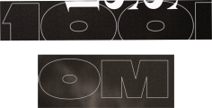
I would use Ol London for the OM, and the capital O is closer to the zero in the post. The one, doesn't match, but easy to modify.
Not the font - just a substitute.
Not the font - just a substitute.
Vorgeschlagener Font: London

Identifizierter Font: Bangstyle

You are right, not Times Roman - but it sure looks like Times New Roman. I'll leave it as a suggestion.
Vorgeschlagener Font: Times New Roman Bold
Alle Zeitangaben sind CEST. Es ist jetzt 18:20
