
Forum
3.278 posts Identifizierte Fonts Nur Anfragen
Posts von Tomás Silcher

Candela te digo a modo de comentario nomás que es muy probable que estés buscando la fuente original que es la que te recomiendan los chicos acá. La muestra que vos pusiste me da la impresión que es un versión (mal) redibujada de un poster de Keep Calm con una tipografía que no corresponde.
Ahora bien si no es el caso y lo que necesitas es si o si esa tipografía entonces avisanos y seguimos buscando.
Ahora bien si no es el caso y lo que necesitas es si o si esa tipografía entonces avisanos y seguimos buscando.

Both must be based on the same font, but apart from missing the Eva´s serifs this one is also much lighter.
Bearbeitet am 01.11.2012 um 16:32 von Tomás Silcher
Bearbeitet am 01.11.2012 um 16:32 von Tomás Silcher
"G" & "S" are different.

"PROMAT"
This looks like a Typeface Seven used as SC with an extra stroke to compensate the weights.
This looks like a Typeface Seven used as SC with an extra stroke to compensate the weights.
Vorgeschlagener Font: Typeface Seven
Identifizierter Font: Capture It

If you mean the PROINGEO ... maybe you can ask others but i think they will agree on Futura. 

Vorgeschlagener Font: Courier New
Vorgeschlagener Font: Trade Gothic Bold Condensed Nr. 20

Identifizierter Font: Palatino Roman


Vorgeschlagener Font: Futura Extra Black


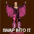
Identifizierter Font: ITC Benguiat Bold

Identifizierter Font: Futura Medium
good observation. But quotes "" are not from XBold either. 


Identifizierter Font: Futura Bold
Image is quite small and fuzzy but could be "Bodoni SH Bold Italic"...
http://myfonts.us/td-3TbPoW
Bearbeitet am 31.10.2012 um 17:50 von rocamaco
http://myfonts.us/td-3TbPoW
Bearbeitet am 31.10.2012 um 17:50 von rocamaco

Identifizierter Font: Linotype Didot
Alle Zeitangaben sind CEST. Es ist jetzt 02:35
