
Forum
47 posts Identifizierte Fonts
Posts von stewf


Dawn is Klarissa a freebie digitization of Titania. Read more here: https://fontsinuse.com/uses/44537/the-weeknd-dawn-fm-album-art
Vorgeschlagener Font: Klarissa

The small type is Monoline Script https://www.myfonts.com/collections/monoline-script-mt-font-monotype-imaging
Bearbeitet 2 mal. Zuletzt bearbeitet am 10.07.2023 um 08:03 von frd
Identifizierter Font: Monoline Script
Bearbeitet 2 mal. Zuletzt bearbeitet am 10.07.2023 um 08:03 von frd
The main title is hand lettering, not a font. Similar:
Latino Rumba https://fontsinuse.com/typefaces/40779/latino-rumba
Screwby https://www.myfonts.com/collections/screwby-font-pink-broccoli
Bearbeitet am 10.07.2023 um 08:02 von frd
Latino Rumba https://fontsinuse.com/typefaces/40779/latino-rumba
Screwby https://www.myfonts.com/collections/screwby-font-pink-broccoli
Bearbeitet am 10.07.2023 um 08:02 von frd
I think Jason293 had the right idea. It looks like someone took Times Extra Bold (Dutch 801 is Bitstreams version) and added swashes and foxtail terminals on the a. If you want something with these swashes built in try:
Bookmania https://fonts.ilovetypography.com/fonts/mark-simonson/bookmania?ref=typ
Kristopher https://www.fontspring.com/fonts/vintage-voyage-design/kristopher?refby=typ
Romantica https://www.myfonts.com/collections/romantica-pro-font-cruz-fonts?rfsn=6624774.1c86e7
Bearbeitet am 09.07.2023 um 21:45 von stewf

Identifizierter Font: Cooper Black Italic

Given the wide stance, and a that wraps around more up top, this is more likely ITC Franklin Gothic Book. (Compare with. Trade Gothic Bold: http://www.identifont.com/differences?first=itc+franklin+gothic&second=trade+gothic+bold+no.+2&q=Go)
If you're interested in the original Star Wars opening titles, which used Trade Gothic Bold No. 2: https://fontsinuse.com/uses/49364/star-wars-opening-crawl-and-titles
If you're interested in the original Star Wars opening titles, which used Trade Gothic Bold No. 2: https://fontsinuse.com/uses/49364/star-wars-opening-crawl-and-titles
Vorgeschlagener Font: Franklin Gothic
Here's an extensive article about the original, printed in Franklin Gothic Extra Condensed: https://fontsinuse.com/uses/1159/war-is-over-if-you-want-it

Looks painted, so may be based on the original metal type, Athenian Extended https://fontsinuse.com/typefaces/121639/athenian-extended. Clifton https://www.205.tf/Font/30/clifton/ is another digital variation.
Vorgeschlagener Font: Athenian Extended

If printed in metal type, this is likely Rhapsodie. There are various digital revivals.
Vorgeschlagener Font: Rhapsodie
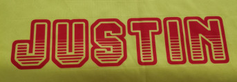
Not a font.

There are many fonts based on iron-on letters from the 1960s. This is the closest I can find:
Vorgeschlagener Font: Iron-on Blackletter

This is a custom logotype based on Eagle Bold. You might also like FB Eagle.


This may be custom lettering. I recommend Domaine Display as an alternative, though it lacks the swashes.
Bearbeitet am 27.08.2021 um 04:15 von frd
Vorgeschlagener Font: Domaine Display
Bearbeitet am 27.08.2021 um 04:15 von frd

These are most likely hand lettered, not a font. But Microgramma was probably a model, and may have been used to set 20. The biggest difference is in the S which appears to be custom, along with the tapering affect.
Vorgeschlagener Font: Microgramma Extended Bold
This is similar to Gotham, but not it. The bowl of the R is too large (diagonal too short).

Identifizierter Font: American Captain

Identifizierter Font: Open Sans Extra-bold

Identifizierter Font: Citypop Main
Alle Zeitangaben sind CEST. Es ist jetzt 17:19
