
Forum
1.205 identifizierter fonts Alle Beiträge
Identifizierte Fonts von donshottype


Identifizierter Font: Gang of Three

Identifizierter Font: Hessian

If you prefer a different weight or width, an assortment is available at MyFonts
http://myfonts.us/td-P8uoen
Bearbeitet am 17.08.2016 um 08:45 von donshottype
http://myfonts.us/td-P8uoen
Identifizierter Font: Chinese Rocks
Bearbeitet am 17.08.2016 um 08:45 von donshottype
Altast Greeting is perhaps the the most likely name for this script digitized in the early 1990s. It has various other names including Alto Greeting Script, Happy Birthday, Alton Greeting. None of them has a current legitimate download. The pre-digital font went under the name American Greeting.
Greeting card companies use their own names for the script. Crane calls it Kensington.
The image is rendered from the OPTI clone, released as Alto Greeting Script

Bearbeitet am 16.08.2016 um 19:48 von donshottype
Greeting card companies use their own names for the script. Crane calls it Kensington.
The image is rendered from the OPTI clone, released as Alto Greeting Script
Identifizierter Font: Altast Greeting
Bearbeitet am 16.08.2016 um 19:48 von donshottype
Identifizierter Font: Blair Medium


Adjusted to make it work for embroidery
Identifizierter Font: Ravenscroft
Bearbeitet am 16.08.2016 um 15:05 von donshottype

Identifizierter Font: Rodchenko Bold

Impact matches _RIFFI_
The other letters of _FLOYD GRIFFIN_ look like horizontally stretched versions of Impact
The other letters of _FLOYD GRIFFIN_ look like horizontally stretched versions of Impact
Identifizierter Font: Impact

Identifizierter Font: Cambria Bold

Identifizierter Font: Diamante ExtraBold
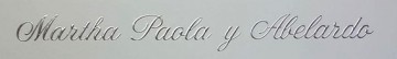
Monotype Corsiva redrawn with inconsistent bolding and edits: Swash on _B_ pulled back to fit logo space, connector on _a_ sharpended at base and lengthened, connector on _e_ lengthened, connector pasted between _S_ and _h_, connectors on _h_ and _p_ lengthened, base serif on _p_ clipped.
As for the bolding some parts are close to Monotype Corsiva Bold, available at Linotype https://www.linotype.com/1249835/monotype-corsiva-bold-product.html, but others are not.
IMHO a clumsy rework by the logo maker.
As for the bolding some parts are close to Monotype Corsiva Bold, available at Linotype https://www.linotype.com/1249835/monotype-corsiva-bold-product.html, but others are not.
IMHO a clumsy rework by the logo maker.
Identifizierter Font: Corsiva

Identifizierter Font: Add City Boy
Identifizierter Font: Pump Bold

Using alt _N_ and _R_
Bearbeitet 2 mal. Zuletzt bearbeitet am 13.08.2016 um 23:07 von donshottype
Identifizierter Font: Sailors Tattoo Special Half
Bearbeitet 2 mal. Zuletzt bearbeitet am 13.08.2016 um 23:07 von donshottype

Identifizierter Font: ITC Honda


Ravenscroft
Identifizierter Font: Ravenscroft
Bearbeitet 2 mal. Zuletzt bearbeitet am 09.08.2016 um 20:05 von donshottype


Hoefler's Didot 16 Bold
or perhaps Hoefler's Didot 24 Bold.
The hairlines in Didot 24 are thinner than Didot 16.
Need a higher definition image to say which one
Identifizierter Font: Didot 24 Bold


Ravenscroft edited to paste the lower rhs terminal of the lower case _k_ on _K_, and paste regular terminals over the fancy ones at the bottom of _M_ and _N_.

Bearbeitet am 09.08.2016 um 11:31 von donshottype
Identifizierter Font: Ravenscroft
Bearbeitet am 09.08.2016 um 11:31 von donshottype

Identifizierter Font: Amati
Alle Zeitangaben sind CEST. Es ist jetzt 19:57
