
Forum
5 posts
Font Puzzle with many pieces! (not splittable)
I am guessing that the first letters of all the font names will carry some sort of encoded message when they're all listed out.
* (edited to include notes about community-identified fonts! Thank you, very much!)
Here are the guesses. Ones *(in parentheses)* have been vetted by one or more community members (credit given) and are considered correct.)
Main Body
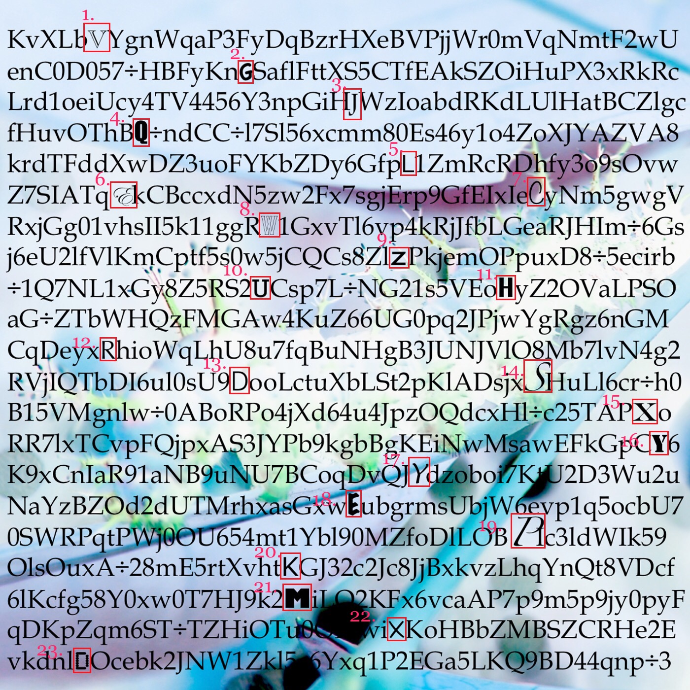
Font: ???Palatino
_______________________
1. V=??? Garamond
(2. G= Apple Casual/credit:toto@k22)
3. J=??? Footlight
4. Q=???Impact
5. L=???Venus/Verdana/Basic Gothic
6. E=???Edwardian Script
7. C=???Filmotype Alice
8. W=???Odessa
9. Z=??? Banque Gothique RR
10. U=???Rockwell
11. H=???Acumin Pro Condensed Bold
12. R=???FF Advert/Optima Roman
13. D=???Hypatia Sans/PT Sans/ Grotesk S SH Book Scangraphic
14. S=???Linotype Zapfino Extra One
15. X=???Scotch Roman MT
16. Y=???Stencil MT
17. Y=???Lucida Handwriting Italic
18. E=???Marker Felt Wide
19. P=???Zapfino Extra One
20. K=???Scene
21. M=???Humanist 521 Ultrabold
22. X=???Peppo
23. D=???TBMatrix Dot
Whew. Thank you all, merely for reading! I am grateful if any help can be rendered to me with this dataset.
ORIGINAL HEADER TEXT:
Greetings,
There is an unsolved puzzle/mystery in a game called Frog Fractions 2, which is both a computer game and an ARG (Alternate Reality Game).
This puzzle was posted, shortly after the game was released (hidden inside a game called on 25th Dec 2016. It uses fonts and is related to finding future game content.
The puzzle is to be found in the following image, released with the soundtrack album: (retrieved 25th Jan 2017, from https://ryanike.bandcamp.com/releases (paid content).
It is an incomprehensible jumble of letters. I have included the original picture, as well as a version that has all of the letters that I could find that had fonts that differed from the rest, outlined with a red box.
I realize this's a lot to ask people to look at. My hope is that the hunt might be fun and so I've numerically indexed the letters that have different fonts to make it easier to reference.
ps I will of course credit whomever contributes to correctly identifying the letters herein, and the Dafont/wider typography community in general. Thank you!
Bearbeitet 7 mal. Zuletzt bearbeitet am 21.07.2017 um 05:08 von terkimfethrog
* (edited to include notes about community-identified fonts! Thank you, very much!)
Here are the guesses. Ones *(in parentheses)* have been vetted by one or more community members (credit given) and are considered correct.)
Main Body
Font: ???Palatino
_______________________
1. V=??? Garamond
(2. G= Apple Casual/credit:toto@k22)
3. J=??? Footlight
4. Q=???Impact
5. L=???Venus/Verdana/Basic Gothic
6. E=???Edwardian Script
7. C=???Filmotype Alice
8. W=???Odessa
9. Z=??? Banque Gothique RR
10. U=???Rockwell
11. H=???Acumin Pro Condensed Bold
12. R=???FF Advert/Optima Roman
13. D=???Hypatia Sans/PT Sans/ Grotesk S SH Book Scangraphic
14. S=???Linotype Zapfino Extra One
15. X=???Scotch Roman MT
16. Y=???Stencil MT
17. Y=???Lucida Handwriting Italic
18. E=???Marker Felt Wide
19. P=???Zapfino Extra One
20. K=???Scene
21. M=???Humanist 521 Ultrabold
22. X=???Peppo
23. D=???TBMatrix Dot
Whew. Thank you all, merely for reading! I am grateful if any help can be rendered to me with this dataset.
ORIGINAL HEADER TEXT:
Greetings,
There is an unsolved puzzle/mystery in a game called Frog Fractions 2, which is both a computer game and an ARG (Alternate Reality Game).
This puzzle was posted, shortly after the game was released (hidden inside a game called on 25th Dec 2016. It uses fonts and is related to finding future game content.
The puzzle is to be found in the following image, released with the soundtrack album: (retrieved 25th Jan 2017, from https://ryanike.bandcamp.com/releases (paid content).
It is an incomprehensible jumble of letters. I have included the original picture, as well as a version that has all of the letters that I could find that had fonts that differed from the rest, outlined with a red box.
I realize this's a lot to ask people to look at. My hope is that the hunt might be fun and so I've numerically indexed the letters that have different fonts to make it easier to reference.
ps I will of course credit whomever contributes to correctly identifying the letters herein, and the Dafont/wider typography community in general. Thank you!
Bearbeitet 7 mal. Zuletzt bearbeitet am 21.07.2017 um 05:08 von terkimfethrog

2. G looks like it's Apple Casual. See http://www.identifont.com/show?K37 for more info.
Perfect match! That's wonderful; that G was giving me a lot of trouble!
Thank you very much, toto@k22.
Thank you very much, toto@k22.

U looks like Bookman Oldstyle.
@metaphasebrothel Thanks!
True, the 'U' resembles Bookman Old Style. To my eye, the 'U' above has less difference between left and right stems in stroke width. Also, it has slab serifs very similar in width to its stems' whereas Bookman serif strokes are a little thinner.
I didn't look into Bookman very thoroughly maybe there's a weight that fulfills that requirement?
Thank you for your reply and let me know if you have any further thoughts!
Alle Zeitangaben sind CET. Es ist jetzt 19:16
