
Forum
21 posts
why does the font Myndraine render high?
Can anyone tell me why the font Myndraine appears higher above the baseline than other fonts, and how that might be fixed? I opened it in a font editor and it looked like any other font to me, but I'm not very experienced.
Thanks,
Ellen
Thanks,
Ellen

Myndraine is ok.
The x-height is higher than Arial.

Bearbeitet am 27.03.2014 um 19:28 von claudeserieux
The x-height is higher than Arial.
Bearbeitet am 27.03.2014 um 19:28 von claudeserieux
That really does not explain what I'm seeing. It would be good if I could post a screenshot or something, but I see nothing that allows me to do that. How can I attach a graphic file?

Do this: [ img]here the image url[ /img] No spaces.
Bearbeitet am 27.03.2014 um 21:16 von koeiekat
Bearbeitet am 27.03.2014 um 21:16 von koeiekat
Thanks.
So, here's an example where the font is used in a Windows theme. Notice how the first font is centered vertically, while the second shot, showing Myndraine, is too high. There must be some term for this, but I don't know it.
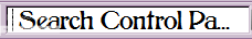
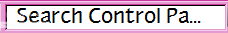
So, here's an example where the font is used in a Windows theme. Notice how the first font is centered vertically, while the second shot, showing Myndraine, is too high. There must be some term for this, but I don't know it.


What software ?
You mean which font editor? TypeTool.
No, the software that you want written.

I'm just using it in a theme at the moment.
a theme ... is that as explicit as it comes?
On my pc, a theme for windows.
There seems to be something not right with the line gap settings. Could be that is why?
What are line gap settings? It sounds like something that could affect what I'm talking about.
Take a look at your TypeTool manual.
I still have no idea what I might do. Could somebody please explain a little? I'm basically a dabbler/neophyte with eye problems that make it difficult for me to search for a potential answer through a 376 page manual.
Acrobat has a find box. Type 'line gap' in that box and ... Bingo! Now use TypeTool to correct the vertical metrics and then use TransType to convert the TypeTool file to ttf.
You could also consider to use a font that does not cause these troubles.
You could also consider to use a font that does not cause these troubles.

It is not as simple as just finding the phrase in the manual, unfortunately. I looked in the chapter "Vertical Metrics" and there is nothing in there that refers to "line gap." Where the phrase does occur, there is no indication on how to adjust it. TypeTool is not a professional program and it may be the case that it doesn't allow adjustment of the line gap. There are other things I've looked to do with it that it doesn't do. Unless anyone has another idea, I suppose I will have to contact the manufacturer.
As far as finding another font, I have a lot of themes that I've made with other fonts, but this is a font that I really like and I want to use it.
As far as finding another font, I have a lot of themes that I've made with other fonts, but this is a font that I really like and I want to use it.
File/Font Info.../Metric and Dimensions/TrueType Specific

Bearbeitet am 29.03.2014 um 19:14 von claudeserieux
Bearbeitet am 29.03.2014 um 19:14 von claudeserieux
OK, thanks, but when I increase the line gap value, nothing changes.
 Select all Tools/Transform.../ Shift ... Vectical Shift -50
Alle Zeitangaben sind CET. Es ist jetzt 15:41
