Built Titling
in Basic > Serifenlos
built titling el.otfbuilt titling lt.otfbuilt titling rg.otfbuilt titling sb.otfbuilt titling bd.otfbuilt titling el it.otfbuilt titling lt it.otfbuilt titling rg it.otfbuilt titling sb it.otfbuilt titling bd it.otfAnmerkung des Autors
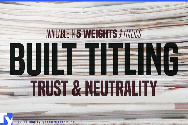
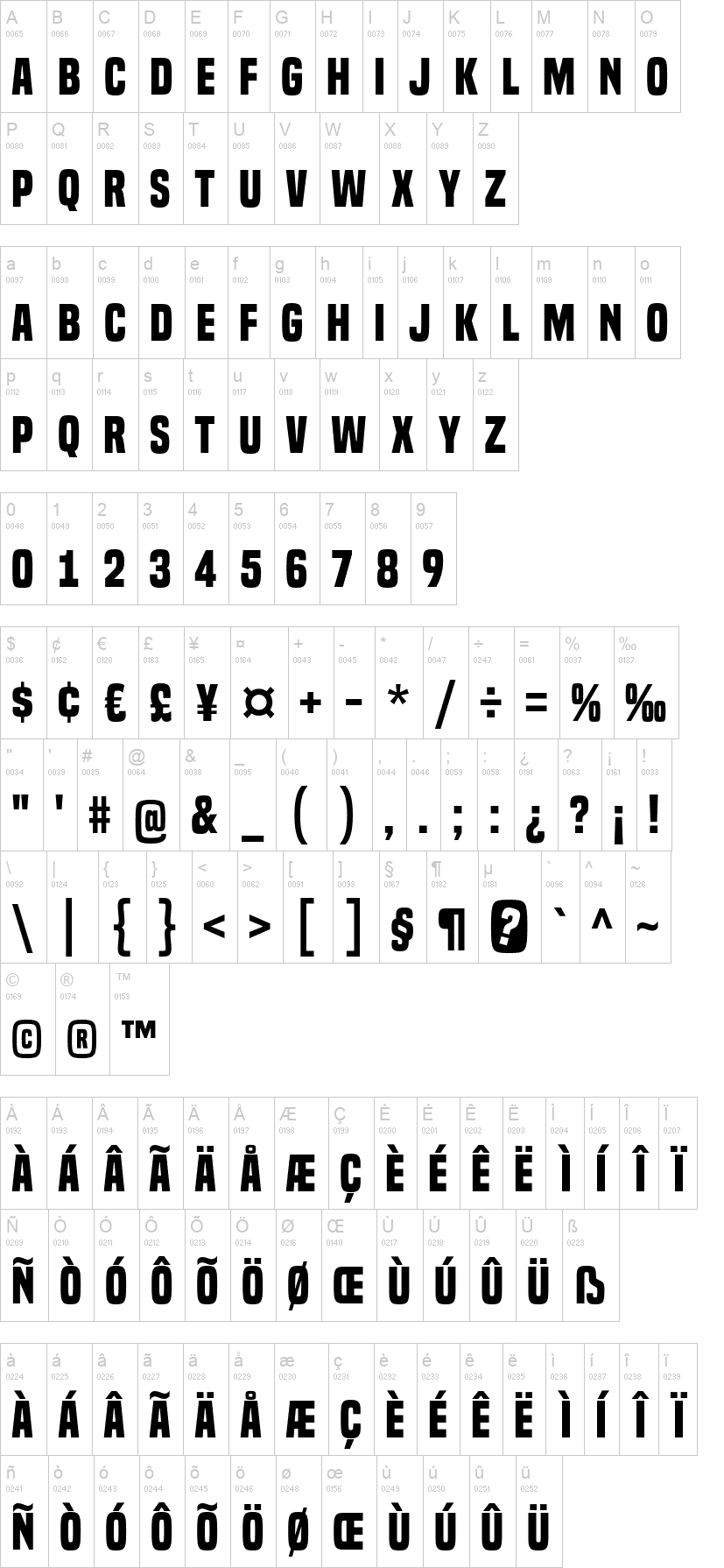
Built's sole purpose is to create sturdy, compact headlines on screen. Its wraparound curves project your headlines in a newsy voice, designed with trust and neutrality in mind. Subtle curls evoke the feel of a different newspaper age without appearing too old-fashioned. The Built family is available in five weights, ranging from Extra-Light to Bold. However, this is not your standard thin to fat linear range. When designing for the screen, light typefaces have practical limits. With variable resolutions and screen sizes nowadays, going lighter means going bigger. Much bigger. And it's no fun if your words slip off the page. Built becomes narrower as it becomes lighter. Now you can scale up those headlines and still have room to spare. Set appealing, oversized page titles without worrying about copyfitting. When you have a list of numbers to align, tabular (monospace) numerals come in handy. But tabular numerals don't look good in headlines, and they take up too much room. Many fonts allow you to select between proportional and tabular numerals. Designers can use OpenType technology to access a variety of numerals, but deploying OpenType features on the web isnt funnor is it always viable. Built has a simple solution: disable kerning and all numerals, monetary symbols, and most math symbols will line upeasy. Built contains fractions, primes, ordinals, and vertically compact accents. As Built loses weight, the asterisk grows more legs, allowing it to appear tonally even in Extra-Light. The italics are thin and loosened on the sides, giving cool emphasis thats more than just a simple slant. Built comes in Extra-Light, Light, Regular, Semi-Bold, and Bold weights, as well as Italics. If you're looking for lowercase letters, visit Typodermic Fonts and look for the full version of Built. Most Latin-based European writing systems are supported, including the following languages. Afaan Oromo, Afar, Afrikaans, Albanian, Alsatian, Aromanian, Aymara, Bashkir (Latin), Basque, Belarusian (Latin), Bemba, Bikol, Bosnian, Breton, Cape Verdean, Creole, Catalan, Cebuano, Chamorro, Chavacano, Chichewa, Crimean Tatar (Latin), Croatian, Czech, Danish, Dawan, Dholuo, Dutch, English, Estonian, Faroese, Fijian, Filipino, Finnish, French, Frisian, Friulian, Gagauz (Latin), Galician, Ganda, Genoese, German, Greenlandic, Guadeloupean Creole, Haitian Creole, Hawaiian, Hiligaynon, Hungarian, Icelandic, Ilocano, Indonesian, Irish, Italian, Jamaican, Kaqchikel, Karakalpak (Latin), Kashubian, Kikongo, Kinyarwanda, Kirundi, Kurdish (Latin), Latvian, Lithuanian, Lombard, Low Saxon, Luxembourgish, Maasai, Makhuwa, Malay, Maltese, Māori, Moldovan, Montenegrin, Ndebele, Neapolitan, Norwegian, Novial, Occitan, Ossetian (Latin), Papiamento, Piedmontese, Polish, Portuguese, Quechua, Rarotongan, Romanian, Romansh, Sami, Sango, Saramaccan, Sardinian, Scottish Gaelic, Serbian (Latin), Shona, Sicilian, Silesian, Slovak, Slovenian, Somali, Sorbian, Sotho, Spanish, Swahili, Swazi, Swedish, Tagalog, Tahitian, Tetum, Tongan, Tshiluba, Tsonga, Tswana, Tumbuka, Turkish, Turkmen (Latin), Tuvaluan, Uzbek (Latin), Venetian, Vepsian, Võro, Walloon, Waray-Waray, Wayuu, Welsh, Wolof, Xhosa, Yapese, Zapotec Zulu and Zuni. Mehr...
Zuerst auf DaFont erschienen: 30.07.2015 - Aktualisiert: 26.01.2023


