
Forum
2.266 carattere identificatos Tutti i post Solo richieste
Caratteri Identificati da pilaster


Lobster Two
Modificato 2 volte. Ultima modifica su 19/04/2012 alle 10:52 da pilaster
Carattere Identificato: Lobster Two
Modificato 2 volte. Ultima modifica su 19/04/2012 alle 10:52 da pilaster

Looks like Optima (demi bold or bold)?
Modificato 2 volte. Ultima modifica su 19/04/2012 alle 01:14 da pilaster
Carattere Identificato: Optima
Modificato 2 volte. Ultima modifica su 19/04/2012 alle 01:14 da pilaster


Trajan Pro for Resident Evil, but with some wacked individual scaling on the letters. And the ORC caps.
Modificato 2 volte. Ultima modifica su 18/04/2012 alle 20:34 da pilaster
Carattere Identificato: Trajan Pro
Modificato 2 volte. Ultima modifica su 18/04/2012 alle 20:34 da pilaster

din-1451-engschrift-alternate. Comma substituted for the apostrophe.
Carattere Identificato: Din 1451 Engschrift Alternate

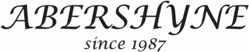
Agreed the cap P is Edwardian but I think the lowercase letters are Commercial Script
Carattere Identificato: Commercial Script


THE and OF glyphs are Adobe Wood Type Ornaments Std
Carattere Identificato: Adobe Wood Type Ornaments


'urry's' could be Friz Quadrata (if it's not, it's pretty close)
Carattere Identificato: Friz Quadrata

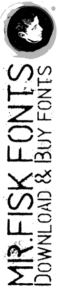
Looks like a very distressed Boston Truckstyle but it's so distressed, it could be any number of spurred western fonts. Got a cleaner version?
Carattere Identificato: Boston Truckstyle
http://www.letterheadfonts.com/fonts/bostontruckstyle.php
all lowercase
all lowercase
Carattere Identificato: Boston Truckstyle
Fuso orario: CEST. Ora sono le 19:28
