

Forum
15 posts Solo richieste
Posts di SpideRaY


Carattere suggerito: Expedition Annihilation

Carattere suggerito: The Gifted

I created this font based on my old Justice League of America comic #261 The Final Chapter from the 1970's. With the new DC Comics movie due out in 2017 here is my personal look back over the last 50 years of this particular League of Justice seeking Super-Heroes. This Fan-Font has just gone through a major update 3/5/2017 now at v2.007 now features both the latest JUSTICE LEAGUE movie glyph's on the CAPITALS and and the existing glyph's from v1.007 from the earlier Justice League of America comic from the 1970's. This Fan-Font is now spanning almost 50 years of JUSTICE.
Carattere suggerito: Justice League (Gią suggerito qua)

I created this font based on my old Justice League of America comic #261 The Final Chapter from the 1970's. With the new DC Comics movie due out in 2017 here is my personal look back over the last 50 years of this particular League of Justice seeking Super-Heroes. For the fully kerned OTF embeddable commercial version of this font please visit my Etsy Store
Modificato 2 volte. Ultima modifica su 04/05/2017 alle 15:22 da Rodolphe
Carattere suggerito: Justice League
Modificato 2 volte. Ultima modifica su 04/05/2017 alle 15:22 da Rodolphe

The PERFECT ILLUSION / LADY GAGA typeface is called LICENSE PLATE USA they have used the lowercase letters the capitals are embossed by SpideRaYsfoNtS purchased by Universal Music in September
Modificato su 03/10/2016 alle 19:14 da SpideRaY
Carattere suggerito: License Plate USA
Modificato su 03/10/2016 alle 19:14 da SpideRaY
Selena Gomez and the Scene
Love you like a song
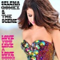
Love you like a song

Created this fan-font based on the movie posters hope you like it shaken not stirred !!!
Carattere suggerito: SkyFall Done
ukaniko ha detto 
Futura No 2 is very close to this
Futura No 2
Futura No 2
The C O H are similar the others are way out
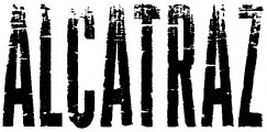
The latest FOX American TV series with Sam Neill and Parminder Nagra by Bad Robot the same guys from the excellent LOST TV series

After a bit of digging it looks a bit ITC Johnston Bold, however only about 80% of the letters are the same the S and C don't have the same angles.
Carattere suggerito: ITC Johnson Bold

I couldn't find the actual font but the actual font is eroded, the closest I could find is Gill Sans Bold, but the S and the R are still wrong so I created my own version called I AM SHERLOCKED you can download this Fan-Font now from DaFont.
Carattere suggerito: I Am Sherlocked (Cattiva risposta)

Maybe but the S and C are very different !!! , I have found a very similar font this is called Paddington Bold is a lot closer but still the kerning is not correct and S is totally wrong on the lead angle
Carattere suggerito: Paddington Bold
The actual font on the DVD used has like a granite pattern overlay, this is the same font with the outlines filled in
I hope this helps I think it might be a customized version of a commercial bold typeface like P22 Underground Cyrillic but with a few letters changed like the S and R
I hope this helps I think it might be a customized version of a commercial bold typeface like P22 Underground Cyrillic but with a few letters changed like the S and R

Looks like a customized version of something like Franchise Bold by Derek Weathersbee it's got all the correct nodes when you set the tracking to 100 in PS, this Movember font maybe a face grown version of this, it could be called Mo Franchise Bold Maybe ? I think that you will struggle to find the actual version !!!!
Until you find the actual font please help me support The Movember Font Team's new 2011 Charity Font available @ http://www.dafont.com/movember.font and then join our team @ https://www.movember.com/uk/register/details/team_id/391442
This Charity font has been created by SpideRaYsfoNtS and is classed as Donationware all proceeds will go directly to the The Prostrate Cancer Registered Charity No.1005541 remember if you download this font please give whatever you can via one of the donation links @ http://uk.movember.com/donate/ OR , also check their associated charity commission website @ http://bit.ly/uddbWP, for further information on Prostrate Cancer please visit the http://www.icr.ac.uk/ OR directly @ http://www.prostate-cancer.org.uk/
Modificato 2 volte. Ultima modifica su 08/11/2011 alle 22:28 da SpideRaY
Until you find the actual font please help me support The Movember Font Team's new 2011 Charity Font available @ http://www.dafont.com/movember.font and then join our team @ https://www.movember.com/uk/register/details/team_id/391442
This Charity font has been created by SpideRaYsfoNtS and is classed as Donationware all proceeds will go directly to the The Prostrate Cancer Registered Charity No.1005541 remember if you download this font please give whatever you can via one of the donation links @ http://uk.movember.com/donate/ OR , also check their associated charity commission website @ http://bit.ly/uddbWP, for further information on Prostrate Cancer please visit the http://www.icr.ac.uk/ OR directly @ http://www.prostate-cancer.org.uk/
Carattere suggerito: Franchise Bold
Modificato 2 volte. Ultima modifica su 08/11/2011 alle 22:28 da SpideRaY
Fuso orario: CEST. Ora sono le 15:13
