

Forum
203 posts Caratteri Identificati Solo richieste
Posts di Neoqueto


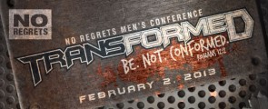
"TRANSFORMED" and "FEBRUARY 2. 2013", in "transformed" spacing narrowed + T and D modified.
Carattere Identificato: Batman Forever

"wembley"
Spacing stretched.
Modificato su 03/10/2012 alle 02:04 da Neoqueto
Spacing stretched.
Carattere Identificato: Adam's Font
Modificato su 03/10/2012 alle 02:04 da Neoqueto


Carattere Identificato: United States

For "electric boy" : Modified R and B.
Modificato su 29/09/2012 alle 09:46 da drf_
Carattere Identificato: Vermin Vibes Diet
Modificato su 29/09/2012 alle 09:46 da drf_

Carattere Identificato: Pepsi

With spacing narrowed a lot.
Free equivalent: http://www.dafont.com/1979.font?text=INTER-TRAC
Free equivalent: http://www.dafont.com/1979.font?text=INTER-TRAC
Carattere Identificato: Mata Condensed
Carattere Identificato: RNS Bobo Dylan


Carattere Identificato: SF Sports Night
Custom "KA" ligature (?) or just spacing narrowed.
Modificato su 20/09/2012 alle 11:17 da Neoqueto
Carattere Identificato: Scala Sans Bold
Modificato su 20/09/2012 alle 11:17 da Neoqueto

It's just Copperplate Bold, since someone has applied a perspective effect. The weight and width vary between "A"s.
Looks a lot like Clarendon, but the "t" is shorter than the ascender and the J hook is a bit different.
Edit: Oh, yeah. The website's source says that it's called Superclarendon.
Modificato 2 volte. Ultima modifica su 18/09/2012 alle 00:32 da Neoqueto
Edit: Oh, yeah. The website's source says that it's called Superclarendon.
Carattere Identificato: Superclarendon Bold
Modificato 2 volte. Ultima modifica su 18/09/2012 alle 00:32 da Neoqueto

Carattere Identificato: Bebas Neue
Fuso orario: CEST. Ora sono le 01:58
