

Forum
2 posts
Apple Font
Hello,
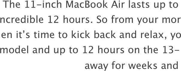
I think Apple uses Lucida Grande for its texts (not headlines where the dots are circles) but when I'm trying to write the same text with the same font my version is not as thin. I don't know if it's an optical illusion or if I'm right.
Thanks guys!
PS: It's neither Myriad Pro (their headlines are though) nor Helvetica (Neue) nor Roboto. I need a web safe version so that Microsoft users are able to see the same font.
Modificato 2 volte. Ultima modifica su 20/04/2015 alle 12:12 da pandaexpress
Apple uses the font "Segoe UI". hope that helped 

Fuso orario: CEST. Ora sono le 07:58
