
Forum
120 police identifiées Tous les posts Requêtes seulement
Polices identifiées par LaurenRuth

Police identifiée : The Dreamer

Police identifiée : LT Oksana


This was an easy one, I can't believe no one identified it yet lol!
Police identifiée : Always In My Heart
Looks like you used a different font for the first letters of each word...
Police identifiée : Intimacy
Police identifiée : Pirulen Bold

Police identifiée : Vademecum

Police identifiée : Teen

Police identifiée : Peace Mustache

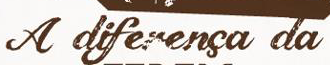
Police identifiée : Champagne & Limousines
Édité 2 fois. Dernière édition le 27/03/2013 à 14:01 par drf_

Note that the two 'm' letters are in emmaus are uppercase whereas the rest is lowercase, i.e. It is "eMMaus"
Police identifiée : Platelet

Police identifiée : Cartonsix NC

The "MAISONCLOSE" font is an earlier version of Champagne & Limousines. The version on Dafont is a newer version, in the new version the points on the top of capital letters are flattened. (I know, shouldn't have changed them!)
The older version can be found online if you search for "Champagne & Limousines Version 2"
I found one right now, but I don't know if it is okay to post the link to it here. (I have had links removed from posts before so I don't want to post it here if it's not okay to do so, sorry!)
The second font I do not know.
Police identifiée : Champagne & Limousines
Police identifiée : Cinnamon Cake

Police identifiée : Champagne & Limousines

Police identifiée : Fantastica

Police identifiée : Scriptina

Police identifiée : KG Fall For You


That is Champagne & Limousines with a system or renderer(sp?) generated bold.
Police identifiée : Champagne & Limousines
Fuseau horaire : CEST. Il est actuellement 23:17
