
Forum
831 posts Polices identifiées Requêtes seulement
Posts par metaphasebrothel

I'm not sure what the second font is, but the text is "Childish Gambino":

(invert the colours on an image when there isn't enough contrast between the text and the background).
(invert the colours on an image when there isn't enough contrast between the text and the background).
l9marebear a dit 
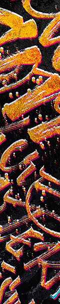
as close as it gets
Phillies Script
Phillies Script
@l9marebear: I'm not qualified to edudicate in Font Identification, but I wanted you to know that our cyber assistant in the moderators forum has flagged your post as suspicious. It's likely because of the image of a sports team logo. The Forum receives spam from people trying to sell bootleg clothing with copyrighted logos. Our assistant alerts us of things like that. He does a great job, but when in doubt, he errs on the side of caution.
In the unlikely even that your post is accidentally deleted by another mod, the time was Dec 06, 2012 at 23:48 :56
~bito
Édité 5 fois. Dernière édition le 07/12/2012 à 01:28 par metaphasebrothel
@fhersh26: There are a number of font editing softwares that can turn your images into a font.
The first question to ask yourself is "Are the source images monochromatic?", ie: entirely composed of black and white. Although there are some editors that can support grey scale, most do not.
Question 2: Do you plan to start making fonts, or do you just want to make THIS font? If you're not sure, koeiekat has mentioned that FontCreator has a 30 day free trial version, so you could look into that. My browser's slow tonight, so I don't have time to find the link.
Font Making involves these steps:
1) Create source graphics. These might be bitmap, .tiff, ai file types, and perhaps some others, depending on the editor being used. The graphics can also be drawn in the font editor, but that requires a lot of skill and experience to do well.
2) Open your font editor, and create a new project file. Enter the 'Font Info' information like font name, family name, etc, the copyright screen, and the version/identification portion, at minimum. I name this font (FontName)beta1, because I know the first test version will not be the one I release.
3) Import your source graphics into the editor. How you do that will depend on the editor you're using, but it's probably some variation of File ->Image ->Open ->Select ->OK. I use monochrome bitmap source graphics. All of your source graphics should have a uniform height
4) Assign Properties to the imported image, ie: Which keyboard stroke will this image represent? The only reason why an M looks like an M in every alphabet font is because the font maker assigned the M position to the image he wanted to have for M.
I draw small black boxes in the corners of the images that will be imported, to specify the frame size I want to use, (not all letters/ characters go all the way to the top or bottom), and I use boxes on the edges that correspond to the base line for letters, if I'm doing an alphabet font. After using these boxes for their purpose, they are erased. I use ScanFont 3, as do about half a dozen other people, and I find it much easier to make these line adjustments after importing the image, but before saving the project file with the new image added.
5) Modify the image: If you're importing the images, don't necessarily expect that they'll be finished inside the editor. The edges may be rough, if your source graphics were not clean enough. Where you wanted a circle, you have a "tinker toy", a roughly round shape composed of a lot of short straight lines and some curved ones. The tools that can be displayed for editing the imported image will vary significantly from editor to editor, and since ScanFont 3 is no longer sold, my available tools and procedures will be different from yours.
6) Save your font frequently, even as often as any positive change. If I'm about to start some editing that I might want to reverse, I'll save the font with a new name, and if I like the changes, I'll never return to the previous version, and it will be recycled. If I don't like the changes, I recycle the current version, and reopen the previous one. ALWAYS save the last version BEFORE you rename it and save again, so you don't lose improvements made in one version, but saved only in a version later deleted. Saving each version with a different sequential name also allows you to have multiple versions of the font-in-progress installed at the same time, so you can type the letter, than compare the display in the current version to the one from which it was modified, to see if it is completed, improved but not completely, or if you've made it worse.
7) Generate a test font: Your first test will disappoint you. What you though was done has only been started. Look at your font at a variety of different point sizes, especially the lowest point sizes that you hope will be useful, (ie: you wouldn't expect to use a fancy script at 10 points. Does it look OK at 36 points?). Very tiny errors in your font editor, (like a line that's almost exactly straight, but not quite), can appear to be huge errors when seen at very small point sizes, even though you might have to enlarge the image in the editor by 20 times to even notice the mistake. Create and save a new version after each generated font, prior to the release version.
Keep repeating 5) and 6) until you're satisfied with the results. Only a few designers are proud of the first font they made, and almost all of them were already skilled in fields related to typography.
8) Make fonts because you want to, not because you hope or expect to make money doing it. Ninety-nine out of a hundred fonts these days seem to be "Free For Personal Use". While there are a few designers who have made profits through FFPU, the vast majority have not earned enough to recover what they paid for their editing software. Make some money at it if you can, but don't expect to. If making fonts was an hourly paid job, the salary would be well below minimum wage.
~bito
koeiekat, in the thread missing...! in the English forum: http://www.dafont.com/forum/read/73739/missing, you advised coletteinvancouver of problems with the ascenders and descenders in Quilted Butterfly, Rat Infested Mailbox and Prophesy Script. Could you please provide some information about how to calculate the correct values of these vertical metrics, (in layman's vernacular, please!).
I use ScanFont 3, and I know where to find the ascender/ descender values, and I know I can have the program recalculate them, but I don't know what the numbers mean.
Many would be enriched if you would share a small part of your vast technical knowledge, and that disseminated knowledge may lead to better quality uploads to Dafont.
Thanks,
~bito
@8kids4us: You should know that ♦everyone♦ who has replied to you in this thread is a forum moderator. Remember that, and think first before deciding whom you should call a dick, unless you have a dynamic IP address.
If you had opened the font in preview before using it, you would have been able to tell that the letters are very small at lower point sizes. That's probably because Jellyka wanted it that way. She knows a thing or two about making fonts. Usually handwriting fonts are of dubious use at small point sizes, because people don't usually write in tiny script, except for teenage girls with issues.
If you had opened the font in preview before using it, you would have been able to tell that the letters are very small at lower point sizes. That's probably because Jellyka wanted it that way. She knows a thing or two about making fonts. Usually handwriting fonts are of dubious use at small point sizes, because people don't usually write in tiny script, except for teenage girls with issues.
@ Looneytunerian: The fact that the letters e, n, r, s, and t in 'Present' and 'Presents' are different should be a pretty good indicator that custom lettering, rather than a font, was used. Your sample letters should be about three times as large, and monochromatic, to be of use to someone who wants to invest 50+ hours of their time in exchange for your undying gratitude.

The monochrome restrictions of Typography make it impossible to create this kind of shading gradient viable at multiple point sizes. Any kind of simulated grey scale will result in a large file size, and problems with memory usage when opened in preview.
If the grey shadows were done in pure black, it could be done, by a talented designer. Here's what the A might look like, if the darkest part of the shadow was made black, and the lighter part white:

I saved the original as a 256 colour bitmap to let MS Paint decide whether the graded shadow should be black or white.
Hope this helps someone identify something similar, if such a font exists.
~bito
For questions not covered in the FAQ.
For every 100 fonts submitted to Dafont, approximately how many are approved for inclusion on the site?
Every so often when downloading, I get a warning window that the font is 'heavy', and may cause problems when opened in preview. Could you explain this problem a bit? Is there a list of fonts that have been deemed 'heavy'?
Thanks,
~bito
Édité le 24/11/2012 à 16:28 par metaphasebrothel
The image above, reduced to 25% size, with colours inverted:


Waltograph Is Name For Font AND A In LAND Is Alteration.
Édité 2 fois. Dernière édition le 19/10/2010 à 03:40 par metaphasebrothel
Police identifiée : Waltograph
Édité 2 fois. Dernière édition le 19/10/2010 à 03:40 par metaphasebrothel
My cat says the main font is Cooper Black.
Jana Orsolic, (formerly Jana Nikolic), has three really nice free script fonts on this site:
http://www.tipometar.org/aktuelno/akcija!/LovelyBG/Index.html
Preview:

The download link is on the left side of the page, in green text, (in English),which says
Open Type, unicode
LovelyBG.zip, 73 kb
The rest of the page is in Cyrillic, so I have no idea what it says.
~bito
Édité le 16/10/2010 à 01:19 par metaphasebrothel
http://www.tipometar.org/aktuelno/akcija!/LovelyBG/Index.html
Preview:
The download link is on the left side of the page, in green text, (in English),which says
Open Type, unicode
LovelyBG.zip, 73 kb
The rest of the page is in Cyrillic, so I have no idea what it says.
~bito
Édité le 16/10/2010 à 01:19 par metaphasebrothel
Week Six update: (As at October 13, 2010 15:18)
The following identifications were disqualified, because they had been previously identified:
Rodolphe: Brush Script, Adine Kirnberg Script, Heartbreaker, Burst My Bubble, Revue, Morpheus
Menhir: Commercial Script
koeiekat: Graveblade
erpico: ITC Avant Garde Gothic Bold
The following additional adjustments were made:
WhatFontis awarded one point for Monotype Bernard Condensed from this thread:
http://www.dafont.com/forum/read/1599/what-is-this-font
deds awarded one point for Unicorn NF from this thread:
http://www.dafont.com/forum/read/1595/police-logo-zapiks
deds awarded one point for New Circle from this thread:
http://www.dafont.com/forum/read/1557/name-of-this-font
deds awarded one point for Johnny from this thread:
http://www.dafont.com/forum/read/1019/font-on-sticker-inside-my-freezer
koeiekat awarded one point for Duo-Line from this thread:
http://www.dafont.com/forum/read/1509/panzeri-font
rockystress not awarded a point for identifying his own font in this thread:
http://www.dafont.com/forum/read/1617/what-font-is-the-big-text
Current Standings, this week's identifications in (parentheses):
Leaderboard: LW: Last Week TW: This Week
tophy52 (LW #1 TW #1) 110 IDs (6 this week)
Klingon, Script-S800, Pergamon, Mia's Scribbling, Tango, hullunkruunu, punksnotdead, Officer X, Glowworm, Engravers Gothic Bold, Wichita Black, Handel Gothic, African, Philly Sans, Heartbreaker, Major Productions NF, Commercial Script, Popstars, Saginaw, Calligrapher, Deutsch Gothic, Vampire Regular, Happy Killer, Hattenschweiler, Swiss911xcn, Blackout, 01digitall, Caxton Bold,Asrafel, N Gage, Trajan, Angelina, Saved by Zero, Prokofiev, Magnum, Bitsumishi, Duval, Blade 2, Ballantines, Libby Script, Space Age, Dare Devil, Half project logo, Creampuff, Feast of Flesh BB, BD Extrawurst, Earth, Strenuous, Grilled Cheese Cond, Soda Script Bold, Jungle Life, Grobold, Impact, Bonzai, Papyrus, Research Remix, Regular Normal, Symbol ITC, Stiff Neck, Nightmare Before Christmas, Pristina, Kaufmann Bold, FF Dax medium, Arsenale White, Lydian, 101! Star Lit, Desigers, Vivaldi, Inkburrow, BD Cartoon Shout, Handwritten Crystal, Allianz Sans, Tiranti Solid, EcuyerDax, TF Arrow Book, City Pro Medium, Frutiger 45 Light, VF Sans Condensed, Blur, Sexy Rexy, Helvetica, Compacta SB Regular, Victorian Inline Shaded, Edwardian Script, Fiolex Girls, Lucida Calligraphy, Percolator, Kismet Regular, Dali Font, Pointy, Morpheus, Herkules, Futura Heavy, Sneaker Script, Freestyle, Judas Caps, Showcard Gothic, Battlefield, Stamp Act, Omnibus, SG Garamond, Copperplate Gothic, Myriad Bold, Hessian, (914, Informal 011, Algerian, Alphamac, Knockout HTF70, Flemish Script)
koeiekat (LW #2 TW #2) 95 IDs (5 this week)
Brush Script, Mahogany Script, P22 Cezanne, Loki Cola, Poor Richard, PT Express, Mordred Demi Bold, AL Sandra, Nadianne, LD Adornment, Cataclysmic, Wolven Script, Bickley Script, Myriad Semibold, Scrawl Light, Caxton, Dark Crystal Script, Ondine, Pea Weenie, Mead Bold, Times New Roman, Bambino, Year2000Boogie, Arričre Garde, Sudestada, BD Bardust, Ginga, Giddyup, Palatino Medium, aaaiight!, Gartentika, Vag Rounded, Mathmos Original Italic, SG Brush Script SB Regular, Lithos, Bradley Hand, Henry Morgan Hand, Curly Coryphaeus, Bounce Script, LHF Billhead 1910, crazycrazy, Nomarch, Dispose Light, LHF Village, advent, Myriad Pro Condensed, Bickham Script, teen, Alexis, DigitalX, Simple Regular, Tiffany Heavy, LHF Sarah Script, Jokerman, Windsong, Mouth, Octavian, Florencesans, Glass Houses, Cyclo, Magistral Black, Circle, La Carte, Buttermilk, Caflisch Script Bold, Coiled Uncial, Authentic Ink Normal, Fenway Park, BodegaSans-BlackOldstyle, Kingthings Typewriter, Burst My Bubble, Crop Types, Garage Shock, Last Ninja, Stop, Plaza, Crackhouse, FG Alison, Pea Carrie Script, BN Stile Project, Great Circus Clean Bold, Pea Missy Cursive, Serif Gothic Black, Ultras Liberi, Party, Diode, Westway Westbound, Armor Piercing, Affair, Rondo, (Decotech, Duo-Line, Arts and Crafts Regular, Berylium, Graveblade)
Rodolphe (LW #3 TW #3) 93 IDs (15 this week)
Umbra, Raphael, Dark Crystal, Troglodyte Pop, Pricedown, TF Avian, Mondo Redondo, Y2K Neophyte, Boo Boo Kitty, Çarsi, Arnold Böcklin, SF Automaton, Cooper Black, Katzcatz KG, Action Jackson, Bergell, Frakturika, El&Font Bubble, The King and Queen, The Poison, Bank Gothic, 4Yeo Out, Porky's, The Last Font I'm Wasting On You, Osaka Sans Serif, Depraved, Stencil, 3 the Hard Way Rmx, Astronaut, VTKS Revolt, Younger Than Me, Planet Benson, Chopin Script, Sketch Block, Clementine Sketch, Freebooter Script, Lemiesz, A Charming Font (ex), Nemo, Airmole shaded, Ethnocentric, King Cool KC, Comic Sans, MS Alba, Neon, Jump Start, Revue, Kaileen, DreamScar, Anagram, Little Rickey NF, Dirtybag, Blackhawk, SkaterDudes, Rustler, Harabara, Copper Penny DTP, Bad Mofo, Mandingo, Good Girl, Nada, Tourist Trap, Fabianestem, Inked God, Aerojones NF, Pop Magic, Mad Science, Clubland, Neuropolitical, Fabulous 50's, Souper 3, Amazone, Adine Kirnberg Script, Violation, Dream Orphans Bold, akaPotsley, Low Down Cut, Mallory Maloney's Handwriting, (Frazzle, Samarkan, Renaissance, Ruach, Casual, Corleone, DJ Gross, Beyond Sky, Budmo Jiggler, Christopher Hand, The Maple Origins, Bangalore, Mizu Font Alphabet, Comic Sans Bold, Sofachrome)
vinz (LW #4 TW #4) 40 IDs (3 this week)
Hotel Coral Essex, Davida, Mistral, Halter, Myriad, Futura Black, Choc, Carpenter, Myriad Pro Italic, Arial, Xirod, Fontesque, Helvetica Black, Pis LIETZ Lindham, FF Dax, Passions Conflict, Waltograph, Candice, ITC Avant Garde Gothic Bold, Supernatural Knight, Neuzeit Grotesk Black, Arial Black, Futura Condensed Extra Bold, Futura Condensed Extra Bold Oblique, Wichita Bold, Monotype Corsiva, Brock Script, A La Nage, Bleeding Cowboys, Moan Hand, Aristotle punk, ITC Machine, Bagpack, Friz Quadrata, Nioubes, Handy, Fette Fraktur, (Gotham, [ank]*, Blippo Black)
deds (LW #6 TW #5) 27 IDs (8 this week)
Secession-Afisha, Normal, P22 Da Vinci, FF Dax Bold, BN Police Regular, Legrand, HYPD BD Bardust Remix, Flower 3, N-Gage, Andes, Bombardier, Cartoon, Triplex Sans ExtraBold, Futura ND Black, Novarese Std Bold, Rough Draft, Hemi Head 426, Aachen Bold, Neuropol X, Rockwell MT, (Banco, Unicorn NF, New Circle, London, Johnny, Jerry's Handwriting, Code Light, Eurostile Ext2 Bold)
daaams (LW #5 TW #6) 23 IDs (3 this week)
Billie Barred, Scriptina, Seven Swordsmen, American Typewriter Bold, Forte Regular, Hulkbusters, Zapfino, Balloon, Atari Kids, Madredeus, Mrs Eaves Small Caps, Asenine, Arial Bold, Allstar, LPF par Eric de Berranfer, Dirt2 Soulstalker, Porcelain, Bernard MT Condensed Regular, Helvetica Bold, Futura Extra Bold, (Ourtype Sansa Light, Avant Garde Gothic, Avant Garde Gothic Alternates)
WhatFontis (LW #8 TW #7) 20 IDs (15 this week)
Future Regular, SF Grunge Sans, Baruta Black, Beware, Roundhand Black BT, (Monotype Bernard Condensed, Excalibur Logotype Normal, ITC Blackadder, Bernhard Tango, Hand of Sean, Mountain, Slant, Firefly Castle, Fineliner Script, Cookies, Lucida Handwriting Italic, Cantoria MTStd-Extra Bold It, Freehand 521, Dreaming of Lilian, Magneto Bold)
claudeserieux (LW #7 TW #8) 7 IDs
Burgues Script, Unity, Adios Script, Big Noodle Titling, Neo Sans Black, AT Benguiat Friskysee, Euclid
Heron2001 (LW#9T TW #9T) 4 IDs
Benguiat Bold Italic, Bodega Sans Medium, Plaza, ITC Avant Garde Book
danihonorato (LW #9T TW #9T) 4 IDs
Dr Carbfred, Spring, Zebra, Honey Script
erpico: (LW-- TW #9T) 4 IDs, (4 this week)
(Sauna Swash Italic, Avant Garde Bold, Lubalin Graph Book, Myriad Condensed Semibold)
snilow (LW#11T TW #12T) 3 IDs (1 this week)
Swiss 721 Extended, Optima, (Berlin Sans)
hanoded (LW-- TW #12T) 3 IDs (3 this week)
(Helvetica Hebrew Bold, Circuitry, PhontPhreak's Handwriting)
Amazingmax (LW #11T TW #14T) 2 IDs
Alice in Wonderland, Whoop Ass
JasonArthur (LW #11T TW #14T) 2 IDs
Storm Trooper, Fertigo Pro Regular
Farfadam (LW #11T TW #14T) 2 IDs
Helvetica Neue Lt Std 23 Ultra Light Extended, Geist Bold
Pathriick2801 (LW11T TW #14T) 2 IDs
Kravitz, Pirmokas
neuroman (LW #11T TW #14T) 2 IDs
Metro DF, Amputa Bangiz
dasklem (LW #17T TW #14T) 2 IDs (1 this week)
Herencia, (Titillium Text)
Sethan (LW #17T TW #20T) 1 ID
University Roman
Schwalbenkoenig (LW #17T TW #20T) 1 ID
Fontovision
Kodoichi (LW #17T TW #20T) 1 ID
Rosewood Std
Andrew2 (LW #17T TW #20T) 1 ID
Alpaca 54
chris19 (LW #15T TW #20T) 1 ID
Volvo
bobistheowl (LW #17T TW #20T) 1 ID
Lobster
adfvalentine (LW #17T TW #20T) 1 ID
Evanescent
brnwrck (LW #17T TW #20T) 1 ID
Viper Black
imaginaryfriend (LW #17T TW #20T) 1 ID
Kredit
KrAsH (LW #17T TW #20T) 1 ID
Black Jack
Nico78160 (LW#17T TW #20T) 1 ID
Traveling Typewriter
rsponsel (LW #17T TW #20T) 1 ID
Arnprior
little-j (LW 17T TW #20T) 1 ID
Jellyka - Nathaniel, a Mystery
querubin (LW #17T TW #20T) 1 ID
FF Typeface 6
linki2675 (LW #17T TW #20T) 1 ID
Castellar
kayla_2026 (LW #17T TW #20T) 1 ID
Calibri Bold
Menhir (LW #17T TW #20T) 1 ID
Akzidenz-Grotesk Bold
Dyphilla (LW17T TW #20T) 1 ID
Kipp No 1
elu (LW17T TW #20T) 1 ID
AKApplique White
ThePG (LW #17T TW #20T) 1 ID
Parchment
Lively (LW #17T TW #20T) 1 ID
Planet Kosmos
macho (LW-- TW #20T) 1 ID (1 this week)
(Bubbleboy)
wawahaha (LW-- TW #20T) 1 ID (1 this week)
(tierra)
kurtathousandandeight (LW-- TW #20T) 1 ID (1 this week)
(Comic Andy)
mmmikey (LW-- TW #20T) 1 ID (1 this week)
(Goudy Sans Black Italic)
daKeeb (LW-- TW #20T) 1 ID (1 this week)
(Beesknees)
~bito
Édité le 15/10/2010 à 18:59 par metaphasebrothel
All weights of Titillium, including FontLab .vfb project files:
http://www.campivisivi.net/titillium/download.html
Édité le 15/10/2010 à 11:07 par metaphasebrothel
http://www.campivisivi.net/titillium/download.html
Édité le 15/10/2010 à 11:07 par metaphasebrothel
No final decision has been made for this one in the Leaderboard, but I'll keep this thread active, in case there aren't other additional posts.
koeiekat has already identified Mordred Demi Bold in this thread:
http://www.dafont.com/forum/user.php?user=209595&p=20
Édité le 14/10/2010 à 23:57 par metaphasebrothel
koeiekat has already identified Mordred Demi Bold in this thread:
http://www.dafont.com/forum/user.php?user=209595&p=20
Édité le 14/10/2010 à 23:57 par metaphasebrothel
This might be easier to identify with the colours inverted on the graphic

deds, no decision has been made yet as to whether this qualifies as an identification for the Leaderboard. This post keeps the thread active for future consideration.
Christmas fonts at dafont:
http://www.dafont.com/theme.php?cat=804
Christmas fonts with accented characters:
Santa's Sleigh, Christmas Card
Elsewhere:
Plymouth Rock 'Snow Dusted' http://www.fontspace.com/hypotypo/plymouth-rock-snow-dusted
Lombard Plattfuss http://www.fontspace.com/manfred-klein/lombardplattfuss
Humbug http://www.fontspace.com/blahfonts/humbug
It looks like there isn't much to chose from that have accented characters.
I'm really bad at identifying fonts. The only reason I have 1 ID is because I referred the designer to Luc Devroye for font hosting. All of the ones I recognize have already been identified by other people. Maybe I could identify some Scriptoriums, but only the obvious ones.
My cat can identify Cooper Black. Different weights count as different fonts for the Leaderboard. Impact has only one weight, so it doesn't matter if it's bold or italic.
About half of the new threads in the Font Identification forum have begun in the past month, and the other half covered the 5˝ months since the new forum opened in March.
About half of the new threads in the Font Identification forum have begun in the past month, and the other half covered the 5˝ months since the new forum opened in March.
Fuseau horaire : CEST. Il est actuellement 11:07
