
Forum
16 posts
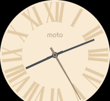
Motorola Watchface
Can anyone identify what font is used for the hour marks of the watchface?
Corvinus Skyline Suggérée par koeiekat
Lido Suggérée par donshottype
Premier Text Suggérée par koeiekat
Bauhaus Medium Suggérée par donshottype
Chalet London 1970 Suggérée par Heron2001
Polices suggérées
Corvinus Skyline Suggérée par koeiekat
Lido Suggérée par donshottype
Premier Text Suggérée par koeiekat
Bauhaus Medium Suggérée par donshottype
Chalet London 1970 Suggérée par Heron2001

Watchmakers generally use custom letters and numbers for their watchfaces.
Some suggestions in http://www.dafont.com/forum/read/255438/clock-font
Add Times Roman to the list of possible sources for the Roman Numerals
One version of Times Roman includes compressed fonts which might work for your watchface: Lido STF Cond Medium or Bold, particularly if you squeeze the width
Édité le 21/02/2016 à 11:19 par donshottype
Some suggestions in http://www.dafont.com/forum/read/255438/clock-font
Add Times Roman to the list of possible sources for the Roman Numerals
One version of Times Roman includes compressed fonts which might work for your watchface: Lido STF Cond Medium or Bold, particularly if you squeeze the width
Police suggérée : Lido
Édité le 21/02/2016 à 11:19 par donshottype

But ... there are others that are just as close to these 3 letters, like the Mercator Condensed.
Police suggérée : Corvinus Skyline
koeiekat a dit
But ... there are others that are just as close to these 3 letters, like the Mercator Condensed.
Corvinus Skyline
Corvinus Skyline
Thank you!

koeiekat a dit
But ... there are others that are just as close to these 3 letters, like the Mercator Condensed.
Corvinus Skyline
Corvinus Skyline
How about the "moto" ?
You didn't ask for that, did you ...
Modified o for this logo.
Not on Parachute's site anymore.
Not on Parachute's site anymore.
Police suggérée : Premier Text
koeiekat a dit
You didn't ask for that, did you ...
Do you want me to create a new question if it's also possible for you or anyone else to just answer the question? Seems a bit unnecessary imo
Etzelt Design a dit
Motorola Watchface
Can anyone identify what font is used for the hour marks of the watchface?
Can anyone identify what font is used for the hour marks of the watchface?
The logo _moto_ is also custom.
Could use ITC Bauhaus Medium, or perhaps ITC Bauhaus Bold, to duplicate if you edit the _t_
Édité le 21/02/2016 à 15:59 par donshottype
Could use ITC Bauhaus Medium, or perhaps ITC Bauhaus Bold, to duplicate if you edit the _t_
Police suggérée : Bauhaus Medium
Édité le 21/02/2016 à 15:59 par donshottype
I opt for the PF Premier Text because of the m and t.
I mentioned ITC Bauhaus Medium mainly because PF Premier Text is no longer available from a legitimate source

I like Chalet London 1970 - easy to modify the "T" - and the O is round!!!
Police suggérée : Chalet London 1970
Is there anything easier than making a round o?
Yes adding a half straight bar to a T... lol
 Or making a sans serif capital I.
Édité le 21/02/2016 à 18:40 par koeiekat
Fuseau horaire : CEST. Il est actuellement 02:03
