
Forum
25 posts
Nintendo Entertainment System, not regular Nintendo font

Mumble conman, mumble ...
Who was it who said 'and you'd need to smooth out some of the inner edges'?
So either the inner edges should be smoothed or should not? Take a look, not a close look, not needed, at your Signets Arthur C. Clarke's The Sands of Mars cover. Compare A and R. Not complicated, they are next to each other. A has sharp corners, R has smoothed corners.
So, cut the crap. It is one of two. Or it is sharp or it is fuzzy (not sharp) but not both in the same setting. In all of the hundreds of thousands of dollars that have gone through my hands never anything where sharp corners became that rounded has happened. Not even with plates for letterpress and certainly not with those differences at the same print or plate.
So may we conclude that Logos/Logotype was made in a hurry with little attention to detail? May we assume that Logos/Logotype was deliberately made as was?
You seem to have all the answers conman, so tell us.
When you are interested in the revival ... tell me


My goodness. Lighten up. I'm simply here to help identify typefaces/designers.
The only person who is going to be able to answer your questions properly is original designer, Roc Mitchell. If we ever manage to obtain the 1970's phototype negative film strips or the official 1999 digitization, we'd be able to see what was intended/included.
I informed you of phototype smoothing/soft-focus as it is a genuine issue that can lead to curved edges in typefaces which do not necessarily have them. Keep in mind that each character is exposed individually and not as a complete word or title layout. Final layout and composition was handled after in the paste-up process.
Also, stop thinking in variables of 2. In the Limited View sample sheet alone there are 3 versions of the J and L. We don't know if this sample is a complete character set - there could have been multiple versions of every character. Plus, there could have been multiple weights/styles for different use that we do not have samples of. In that regard, why can't there be an A with rounded corners at the crossbar, an A with right angles at the crossbar, and another A with a stenciled crossbar?
If the OP was going to use OPTI Limited View and insert characters (F,R,D, etc...) from Eurostile/Microgramma then I suggested slight height adjustments and softening some inner corners so that they do not look out of place aesthetically with the rest of the characters.
Example typeset:

Édité le 11/09/2014 à 13:13 par conman1985
The only person who is going to be able to answer your questions properly is original designer, Roc Mitchell. If we ever manage to obtain the 1970's phototype negative film strips or the official 1999 digitization, we'd be able to see what was intended/included.
I informed you of phototype smoothing/soft-focus as it is a genuine issue that can lead to curved edges in typefaces which do not necessarily have them. Keep in mind that each character is exposed individually and not as a complete word or title layout. Final layout and composition was handled after in the paste-up process.
Also, stop thinking in variables of 2. In the Limited View sample sheet alone there are 3 versions of the J and L. We don't know if this sample is a complete character set - there could have been multiple versions of every character. Plus, there could have been multiple weights/styles for different use that we do not have samples of. In that regard, why can't there be an A with rounded corners at the crossbar, an A with right angles at the crossbar, and another A with a stenciled crossbar?
If the OP was going to use OPTI Limited View and insert characters (F,R,D, etc...) from Eurostile/Microgramma then I suggested slight height adjustments and softening some inner corners so that they do not look out of place aesthetically with the rest of the characters.
Example typeset:
Édité le 11/09/2014 à 13:13 par conman1985
EPILOGUE
Apparently, the original phototype was known as 'Corporate/Corporate Image' during the 70's and 80's. With a name like that, it's easy to see why many large companies and corporations adopted it for logotypes and branding. This is according to Phil Martin's Alphabet Innovations, for whom Roc Mitchell produced several typefaces. This is also not to be confused with the digitally available 'Corporate URW' also originally produced by Phil Martin/Alphabet Innovations as a phototype sometime during the mid-to-late 70's. It's possible this new version by Martin was intended as a replacement or companion to Mitchell's. Both typefaces build upon the geometric framework previously established by 'Microgramma Bold', designed by Aldo Novarese and Alessandro Butti for the Nebiolo Type Foundry in 1952, and 'Eurostile Bold Extended', designed by Aldo Novarese in 1962.
Alphabet Innovations 1974 Catalog - Vol. 1-8

Hard to make out in the above image, but it looks as if both 'Corporate' and 'Corporate Image' were included in Volume 4, which was published in January, 1971.

TIMELINE OF EVENTS
1952 - Aldo Novarese and Alessandro Butti design 'Microgramma' for the Nebiolo Type Foundry.
1962 - Aldo Novarese expands his previous 'Microgramma' design into the 'Eurostile' typeface family for Nebiolo Printech.
1971 - Roc Mitchell produces 'Corporate/Corporate Image' for Alphabet Innovations phototype range.
1979 - Dan X. Solo samples 'Corporate/Corporate Image' as 'Limited View' in his Solotype collection of typefaces. A stenciled version known as 'Preview' is also shown, perhaps developed by Solo himself.
1985 - The Nintendo Entertainment System is released in October to North and South American markets. It uses, not unlike many other companies of the era, 'Corporate/Corporate Image' as the typeface for branding its product range.
1991 - Castcraft produces 'OPTILimitedView' for their OPTIFonts range. As the naming implies, this is based upon the previous Solo sample from 1979. Castcraft also produces Expanded and Open/Outline versions of the font.
1991 - Jay Pierstorff/Computer Safari produces 'Airlock' which is based upon the stenciled version known as 'Preview' previously sampled/developed by Solo in 1979.
1999 - Roc Mitchell digitizes his original design in a series of fonts known as 'Logos/LogoStyle/LogoText'. These are sold through Roc Mitchell Design.
Apparently, the original phototype was known as 'Corporate/Corporate Image' during the 70's and 80's. With a name like that, it's easy to see why many large companies and corporations adopted it for logotypes and branding. This is according to Phil Martin's Alphabet Innovations, for whom Roc Mitchell produced several typefaces. This is also not to be confused with the digitally available 'Corporate URW' also originally produced by Phil Martin/Alphabet Innovations as a phototype sometime during the mid-to-late 70's. It's possible this new version by Martin was intended as a replacement or companion to Mitchell's. Both typefaces build upon the geometric framework previously established by 'Microgramma Bold', designed by Aldo Novarese and Alessandro Butti for the Nebiolo Type Foundry in 1952, and 'Eurostile Bold Extended', designed by Aldo Novarese in 1962.
Alphabet Innovations 1974 Catalog - Vol. 1-8
Hard to make out in the above image, but it looks as if both 'Corporate' and 'Corporate Image' were included in Volume 4, which was published in January, 1971.
TIMELINE OF EVENTS
1952 - Aldo Novarese and Alessandro Butti design 'Microgramma' for the Nebiolo Type Foundry.
1962 - Aldo Novarese expands his previous 'Microgramma' design into the 'Eurostile' typeface family for Nebiolo Printech.
1971 - Roc Mitchell produces 'Corporate/Corporate Image' for Alphabet Innovations phototype range.
1979 - Dan X. Solo samples 'Corporate/Corporate Image' as 'Limited View' in his Solotype collection of typefaces. A stenciled version known as 'Preview' is also shown, perhaps developed by Solo himself.
1985 - The Nintendo Entertainment System is released in October to North and South American markets. It uses, not unlike many other companies of the era, 'Corporate/Corporate Image' as the typeface for branding its product range.
1991 - Castcraft produces 'OPTILimitedView' for their OPTIFonts range. As the naming implies, this is based upon the previous Solo sample from 1979. Castcraft also produces Expanded and Open/Outline versions of the font.
1991 - Jay Pierstorff/Computer Safari produces 'Airlock' which is based upon the stenciled version known as 'Preview' previously sampled/developed by Solo in 1979.
1999 - Roc Mitchell digitizes his original design in a series of fonts known as 'Logos/LogoStyle/LogoText'. These are sold through Roc Mitchell Design.
conman1985 a dit 
I think the minor differences are more a result of Castcraft OPTIFonts poor digitization of it. They are not known for producing quality fonts and I would not be surprised if they simply made their version from the sample in Dan X. Solo's 1979 book.
4-Style Digital Font Family:
OPTI Limited View
OPTI Limited View Open
OPTI Limited View Expanded
OPTI Limited View Expanded Open
Just discovered that Roc Mitchell most likely created the original typeface called Logos/Logostyle. We can now do away with the Limited View moniker.
Hopefully, you can see some of it here:
http://web.archive.org/web/20020402084057/http://www.rocmitch.com/rocmitch/fonts/LogoStyle.htm
When Microgramma was designed in 1952 it went on to become a popular typeface to advertise future technology and science fiction. Further revisions in 1962 added a lowercase and it's popularity increased to the point of overexposure. Now named Eurostile, every technology company and corporation was using it. This lead to 1970's designers finding creative ways to make distinct variants that stood out. One such example is Corporate Image/Corporate URW/Paratype Mania (1971, Phil Martin/Roc Mitchell - Alphabet Innovations International, Inc.), which is clearly borrowing from Microgramma/Eurostile, yet offering a sleeker look. Another variant born out of this trend would have been Logos/Logostyle/Limited View.
10-Style Digital Font Family:
Logos
Logos Oblique
LogoStyle
LogoStyle Oblique
LogoText Thin
LogoText Thin Oblique
LogoText
LogoText Oblique
LogoText Medium
LogoText Medium Oblique
From 1970 until 1974, Roc Mitchell designed typefaces for Phil Martin's Alphabet Innovations.
"I did most of my font design work in the 70's, at a time when the process was more photographic than computerized. My son Paul did the computer work necessary to put my type fonts into computer format, learning as he went."
Roc Mitchell, 1999
Roc Mitchell Design
rocmitchell@home.com | rocfonts@rocmitch.com
Other examples of use:
Nikon Coolscan Film Scanners + Accesories
ColecoVision logotype (probably the reason Nintendo chose to use it too)
Tangerine Dream - Exit (1981) album cover
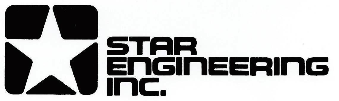
STAR Engineering Inc. logotype (1972)
4-Style Digital Font Family:
OPTI Limited View
OPTI Limited View Open
OPTI Limited View Expanded
OPTI Limited View Expanded Open
Just discovered that Roc Mitchell most likely created the original typeface called Logos/Logostyle. We can now do away with the Limited View moniker.
Hopefully, you can see some of it here:
http://web.archive.org/web/20020402084057/http://www.rocmitch.com/rocmitch/fonts/LogoStyle.htm
When Microgramma was designed in 1952 it went on to become a popular typeface to advertise future technology and science fiction. Further revisions in 1962 added a lowercase and it's popularity increased to the point of overexposure. Now named Eurostile, every technology company and corporation was using it. This lead to 1970's designers finding creative ways to make distinct variants that stood out. One such example is Corporate Image/Corporate URW/Paratype Mania (1971, Phil Martin/Roc Mitchell - Alphabet Innovations International, Inc.), which is clearly borrowing from Microgramma/Eurostile, yet offering a sleeker look. Another variant born out of this trend would have been Logos/Logostyle/Limited View.
10-Style Digital Font Family:
Logos
Logos Oblique
LogoStyle
LogoStyle Oblique
LogoText Thin
LogoText Thin Oblique
LogoText
LogoText Oblique
LogoText Medium
LogoText Medium Oblique
From 1970 until 1974, Roc Mitchell designed typefaces for Phil Martin's Alphabet Innovations.
"I did most of my font design work in the 70's, at a time when the process was more photographic than computerized. My son Paul did the computer work necessary to put my type fonts into computer format, learning as he went."
Roc Mitchell, 1999
Roc Mitchell Design
rocmitchell@home.com | rocfonts@rocmitch.com
Other examples of use:
Nikon Coolscan Film Scanners + Accesories
ColecoVision logotype (probably the reason Nintendo chose to use it too)
Tangerine Dream - Exit (1981) album cover
STAR Engineering Inc. logotype (1972)
http://www.rocmitch.com/rocmitch/fonts/LogoStyle.htm
Epilogue 2: Electric Boogaloo!
There now exist THREE digital options if one wants to use Corporate/Logos in a project.
* AV05 Logotype by con, free on FontStruct
* Need Every Sound by Lyric Fonts, free on DeviantArt
* Corporatus by myself, commercial on MyFonts ( info at https://asr.me/font/corp.html )
There now exist THREE digital options if one wants to use Corporate/Logos in a project.
* AV05 Logotype by con, free on FontStruct
* Need Every Sound by Lyric Fonts, free on DeviantArt
* Corporatus by myself, commercial on MyFonts ( info at https://asr.me/font/corp.html )
Police suggérée : Corporatus
Fuseau horaire : CEST. Il est actuellement 11:44
