

Forum
42 posts Identified fonts
Posts by fridelain
Suggested font: Bernhard Light

The funny thing is that I just googled "geometric slab serif" and *bam!* First result.
Better known as “Memphis“
Edited on Jan 06, 2012 at 08:47 by fridelain
Better known as “Memphis“
Suggested font: Geometric Slabserif 703
Edited on Jan 06, 2012 at 08:47 by fridelain
Asked before (unanswered), but with just EXO as sample.
http://www.dafont.com/es/forum/read/33744/exoplanet
http://www.dafont.com/es/forum/read/33744/exoplanet

Identified font: Helvetica Condensed Black
Suggested font: PTL Aldigo Two


It's probably custom for that dot matrix printer. Do you know the brand?
Here you may find something similar:
http://www.dafont.com/es/bitmap.php
Here you may find something similar:
http://www.dafont.com/es/bitmap.php

Suggested font: Arial Black

You are supposed to overlay Arista or Arista Light Over Arista Extrafilled
Hand Drawn
That font style is known as Blackletter, Old English, Gothic script, Gothic minuscule, or Textura, and there are literally thousands of digital fonts available. Your image is somewhat exceptional in that it uses a modern N capital and is profusely decorated, which hints it may be retouched or hand drawn:
http://www.dafont.com/theme.php?cat=401&text=Nicole&fpp=50
Edited on Dec 30, 2011 at 23:15 by rocamaco
http://www.dafont.com/theme.php?cat=401&text=Nicole&fpp=50
Edited on Dec 30, 2011 at 23:15 by rocamaco
SashiX said 
F&%k, those "r" differs from creator to creator (Adobe, URW, etc. Darn, I hate these small differences they made 
 )
)
To sum up: impossible to say which one is it 100% correct

 )
)To sum up: impossible to say which one is it 100% correct

Happened to me with Baskerville. I was recreating an old favorite book of mine, trying to get as close to the original as possible. Only half the fonts got the distinctive swash of the Q tail right, and only one of these reproduced faithfully the italics interrogation swirl.
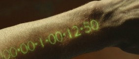
Suggested font: Zeroes
Edited on Dec 30, 2011 at 22:20 by drf_

Possibly Zapfino with it's thousands of alternate glyphs and ligatures.
Maybe “Ole”?
Maybe “Ole”?
Suggested font: Zapfino
Consolas, Bundled with Vista and Office2k7
Can also be downloaded for free as part of the Microsoft Office Compatibility Pack for Word, Excel, and PowerPoint File Formats
Can also be downloaded for free as part of the Microsoft Office Compatibility Pack for Word, Excel, and PowerPoint File Formats
Identified font: Consolas

Save for the Q tail, Univers LT Std 49 Light Ultracondensed is a perfect match
Suggested font: Univers 49 Light Ultracondensed
Helvetica Neue Ultralight. Also, why so many "RELAXED"s here? Is there a competition going on?
All times are CEST. The time is now 08:51
