

Forum
13,712 posts Identified fonts
Posts by koeiekat


Have a look at Hemi Head 426 but I'm pretty sure I've seen that k in another font.
Suggested font: Hemi Head 426
Identified font: Origins

Three different n's. Thus ...
Sorry, can not find that a.
The other way round daaams: Lettering for the Emotum Company in Australia, this assignment had a very concrete briefing: they asked for a similar logo in aesthetics to the emptype.net one ...
@snilow, why not ask Eduardo Manso himself? http://www.eduardomanso.com/
@snilow, why not ask Eduardo Manso himself? http://www.eduardomanso.com/
What do you expect? Rubbish in ... rubbish out.


Identified font: Quares
It hasn't got a name. Can you imagine why not?
The uniformed or the undercover?

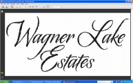
Freestyle Script it is, but you need the Adobe or Corel version for a matching a and d.
Edit kk:
Sorry. I forgot about the alternates in this ITC version.
Edited 2 times. Last edit on Oct 21, 2010 at 09:57 by koeiekat
Edit kk:
Sorry. I forgot about the alternates in this ITC version.
Suggested font: Freestyle Script (Adobe) (Already suggested here)
Edited 2 times. Last edit on Oct 21, 2010 at 09:57 by koeiekat
Ergo, solved.
The Ancient Art of Handwriting.

Identified font: Ink Tank

'did not respect' ... like many, many designers nowadays. Not a very brilliant design anyway.
Whatever, this can only be made with the Century Gothic.
Whatever, this can only be made with the Century Gothic.

Downloaded from the wrong place. 

Try to match JC with another font, considering that the J is just slightly fatter than COLE (caused by using a about 15% larger font size). 


The designer just didn't respect the restrictions on modification in the font license.
All times are CEST. The time is now 11:58
