

Forum
831 posts Identified fonts Requests only
Posts by metaphasebrothel

koeiekat said 
metaphasebrothel said
... Bodoni himself did not design any fonts, because he died in 1813. ...
While I agree with metaphasebrothel's arguments in his post this line puzzeles me ... If Bodoni did not design the Bodoni then who did?

Bodoni designed the typefaces, either on paper, or for printing blocks. The people who digitalized his typefaces designed the fonts used for electronic printing.
Designing a typeface is like creating art. Designing fonts is more like technical drawing, where precision, rather than inspiration, is most important. Those who design both their typefaces and their fonts are both artists and architects.
Edited 2 times. Last edit on Feb 09, 2013 at 21:36 by metaphasebrothel
akasper, everyone who has one or more fonts hosted by Dafont will have a link at the top of each Dafont browser window called My Account. Click on this link, and a list of your fonts will appear, with download totals for the previous day, total downloads to date, and the number of comments made on your font. To the right of the name of each font, you'll see a link called update. Click the update link, and you'll be directed to a separate page of details and preferences about your font. You can update the license terms, add or change artwork, add or change the Note of the Author, etc. After making any changes, click the Submit button at the bottom, and the Dafont Webmaster will probably have your changes processed in 1-3 days.
I think you'll need to have a Paypal account if you want to use a Donationware license, as Dafont does not collect money on behalf of any of the designers showcased here. If you have a Paypal account, in the Note of the Author section, type Note to Webmaster:, and provide the details about your account. Updates are manually processed, so that information would not be displayed to others on the details page for your font.
If you're using a Free for Personal Use license, you should include a read me document with any future submissions, clearly stating the terms of use. For a font already uploaded where the license is being changed, you can state the terms in the Note of the Author section, including an e-mail address to which commercial use inquiries should be directed.
You should also keep in mind that, even though thousands of people may download your font for free, very few would but a license, or donate. My unscientific study comparing the relationship between downloads and font comments suggests that one comment per 80.000 downloads is about average. Donations and license purchases would be even less. claudeserieux who responded to you initially has almost 10 million downloads at Dafont, but I think he's only received about $100 in donations. Almost no one makes a significant income from Free for Personal Use fonts, so don't let that be your motive. Most of use do it for that one comment per 80.000 downloads!
~bobistheowl
Edited 2 times. Last edit on Feb 09, 2013 at 20:28 by metaphasebrothel
What font are they using for the answers on the game show Jeopardy!?
Thanks,
~bito

Thanks,
~bito
Original image: http://img42.imageshack.us/img42/1182/jeopardyf.png
@zerodeluxe: I agree completely, after having had the chance to view Surf and Sugo side by side.
Off topic: From the illustrations on the Luc Devroye page, "her" font "Winter", appears to be a good choice for the Warner Brothers font that LooneyTunerian is trying to get other people to make for him for free in another thread in English forum. It doesn't look like his samples, but it looks more authentic, for what he wants to do. I hope he reads other forum threads besides the one in which he posts, or he might miss out on this:
Too bad he won't be able to find a download site, unless he googles better than the rest of us. Maybe if he wrote to her, she could tell him the font's real name?
@drf_: Could I interest you in translating my post #10 into French? I read the language fairly well, but I write it at a level somewhere between high school and babelfish, depending on whether I need to use verbs in the non present tenses. I would enjoy seeing a French interpretation of my prose. rocamaco could do the Spanish, and koeiekat could do it in Dutch, click language, and meow.
Edited 2 times. Last edit on Feb 09, 2013 at 01:16 by rocamaco
I looked at the @ in Surf and Sugo using ScanFont 3, and other than the colour of some of the nodes, they were identical. Some of the vertical metrics were different. Perhaps the spacing between letters may be different. That doesn't take a lot of skill to change. This seems to cross the line between similar and counterfeit.
@drf_: Thanks for the acknowledgement. I've always thought of the word font as a source, to inspire graphic design, rather than an archaic reference to lead type. It's unfortunate that many take that too literally. Many popular fonts here are just a grunge filter removed from a Windows system font.
Edited on Feb 09, 2013 at 00:45 by metaphasebrothel
While the evidence so far seems to suggest that the Kate Ferrara fonts may be dubious in their originality, there is an import point, not mentioned so far in this thread:
There is a huge difference between designing a font, and designing a typeface. Some designers do both, and some do one or the other.
Here's an example involving my own work:
Outstanding by bobistheowl (2012): http://www.dafont.com/outstanding.font
Shadowed Serif by James Fordyce (1994): http://www.dafont.com/shadowed-serif.font
I didn't design the alphabet used for this font, and it's highly doubtful that James Fordyce did, either. This appears to be a 19th century design. His version has numbers, and mine has a small caps lower case, based on the shadow caps. It's also likely that his image sources were different than mine. Both fonts are different digital interpretations of the same typeface. No harm, no foul.
There's nothing illegal, immoral, or unethical about different font designers using the same design to make different, unique fonts, provided that one font is not used to make the other.
There are hundreds, if not thousands, of Bodoni fonts, all designed, or inspired by designs created by Giambattista Bodoni. Bodoni himself did not design any fonts, because he died in 1813. It's not as if the first font maker to use one of his designs suddenly acquired eternal dibs, as if it was a hotmail address. If it were a crime to create and market fonts based on typefaces designed by others, our jails would be filled to capacity with graphic designers, and Elsner + Flake, among others, would be serving life sentences. Two fonts that look identical in a preview panagram can look markedly different when opened with a font editor; the number and placement of the vector control nodes is usually a good indication of how closely related two digital versions of the same source may be. In other cases, the inclusion of additional glyphs, ligatures, or kerning pairs sets one apart from the other.
It's also perfectly acceptable to redraw a typeface of ambiguous origin as a free font, where a commercial version has previously been released. I'll use the example of Alexandra Leopoldovna Gophmann, who has designed a lot of free fonts that highly resemble commercial fonts rendered by others. I think there are hundreds of fonts that are, essentially, Helvetica, with slight variations to the punctuation, and perhaps some additional cosmetic changes.
What is illegal, immoral, and unethical is to create a font by modifying an existing font, then representing the derivative work as an original composition.
Without the option of directly comparing the Kate Ferrara fonts to those they so clearly resemble, we can't tell the degree of similarity.
@PseudoNypho: She's using Mac OS X - that information is displayed to the forum moderators.
@cara farrell: Whatever problem you had with the naming seems to have been fixed. I opened a copy of your font with Studio5, and all of the name fields show carafont.
When you use the update link on your My Account page, the change is manually processed by the Webmaster, usually within 1-3 days; it's not instantaneous.
~bobistheowl
drf_ said
Hi Ben,
Thanks for bringing this up, I'm hoping we'll find more information about this issue.
Another "strange" resemblance :
http://www.dafont.com/mayonaise-cond.font
http://luc.devroye.org/KateFerrara-Craft-2012.png
 Now... who's the chicken, who's the egg ?
Thanks for bringing this up, I'm hoping we'll find more information about this issue.
Another "strange" resemblance :
http://www.dafont.com/mayonaise-cond.font
http://luc.devroye.org/KateFerrara-Craft-2012.png
 Now... who's the chicken, who's the egg ?
I haven't been able to find a valid link for any page that has Kate Ferrara fonts available for download.
Usually fonts are not accepted if the quality is poor, like if the edges are very rough.
If it's not good enough for Dafont, you could always make a page at DeviantArt or Fontspace. Neither of them has an evaluation process, so anyone can make their font available for download there, regardless of the quality.
If it's not good enough for Dafont, you could always make a page at DeviantArt or Fontspace. Neither of them has an evaluation process, so anyone can make their font available for download there, regardless of the quality.
@ toto@k22: He's using Mac OS X, if that's any help.
baine Take a look at some of the fonts in the Fancy -> Old School Theme: http://www.dafont.com/theme.php?cat=104&page=1
scupbucket said
Oh, okay, great! So it was option #2 ("or should I put the message in the font description and hope they notice it, do it, and remove that part of the message?"). Thanks!
In your experience, do they remove your request from the "note of the author" section before posting it?
In your experience, do they remove your request from the "note of the author" section before posting it?
Yes, the webmaster followed the request, and did not include the request in the Note of the Author text.
Lee, when you submit a new font, you can add an instruction to the webmaster in the Note of the Author section, for custom text display. On my most recent submission, I requested that the banner display be in all capitals.
This appears to be hand drawn by someone who doesn't know how to spell Ocean. My opinion is based on the inconsistent base line and letter heights, and the differences between the two A's.

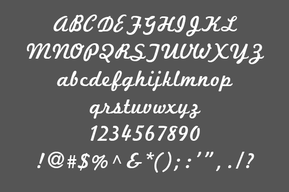
Suggested font: Superstar M54
If the image is in black and white, the quality of a .tff, (or png), will be substatially better than a .jpeg. Open any monochrome image with MS Paint, then save it as a .jpeg, and a fair bit of the black and white will change to various shades of grey. A .jpeg is the picture equivalent of a 96 kbits/sec .mp3.
The text isn't large enough nor clear enough for someone to help you identify the font being used. Try to find a better quality image. If you do that, your question will be moved to the Font Identification forum.
The font looks a lot like Tahoma. You should have that one as part of your Windows 7 operating system.

Edited 2 times. Last edit on Jan 17, 2013 at 06:10 by metaphasebrothel
The font looks a lot like Tahoma. You should have that one as part of your Windows 7 operating system.
Edited 2 times. Last edit on Jan 17, 2013 at 06:10 by metaphasebrothel
XxHestiaxX said
I don't know how to extract the zip files, I tried to, any directions to do that?
When you open the font, there's an install button at the top
When you open the font, there's an install button at the top
XxHestiaxX, a .zip file is a compressed archive containing one or my files. Its file size is smaller than the size(s) of the file(s) contained inside.
If you're going on a vacation, you might sit on top of a suitcase to compress the contents. A .zip file is similar to that.
When you download a file from Dafont, does the icon for the file look like three books, with a belt around them, or like a file folder with a zipper on it, or something else? If it looks like the folder with a zipper, right-click the file, and select "Extract" from the menu. This will open a dialog box, with simple instructions on how to get the files out of the .zip into a folder, usually within the same folder where the .zip file is located. The contents of a .zip file downloaded from Dafont will be a .ttf or .otf font file, and often a 'read me' text document, and sometimes some additional files, (.pdf, image file, etc.). You install the extracted .ttf or .otf file, and none of the others.
If the icon looks like three books, double click the icon, and a Window will open, with Extract as one of the options. Select Extract, and click "Ok". The files that were in the .zip should then appear in a folder that has the same name as the .zip file. Install the .ttf or .otf file that's inside the folder.
~bito
Did you extract the font(s) from the .zip files before trying to install them?
elizabethnelson, your question was already answered by PhontPhreak in the comments section of the font: http://www.dafont.com/font-comment.php?file=phontphreaks_handwriting
Thanks all for the kind comments!
My handwriting font may be used for commercial use, no problem.
It would be nice though, if you could send me a jpeg of what you have done with it.
Have fun eveybody!
PhontPhreak
phontphreak[removetheobvious][at]gmail[dot]com
If a font is designated as Free, you don't have to ask the designer for permission to use it for commercial purposes. If you can find contact information for the designer, most will be appreciative if you send them an image link, so they can see how you used the font they made, but this is optional.
Most freeware font designers just want to give something back to the design community for the free fonts they've downloaded from other people. Adding a nice comment on the details page is as much as they hope to receive from anyone. I have more than 800,000 downloads at Dafont, and I've only received about 10 comments, (not including my own comments). A quick glance at the most popular downloads here suggests that one comment per 80,000 downloads is about average.
Edited on Jan 14, 2013 at 22:55 by metaphasebrothel
All times are CEST. The time is now 10:04
