

Forum
16 posts
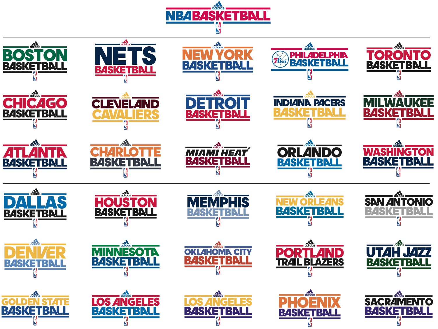
What font was used for the NBA practice jerseys by adidas
pls help what the font is for the nba practice jersey logos! Pls help!
ITC Avant Garde Gothic Pro Bold Suggested by louieannflores
Devil Breeze Suggested by EthanG
Leelawadee Suggested by djones
Suggested fonts
ITC Avant Garde Gothic Pro Bold Suggested by louieannflores
Devil Breeze Suggested by EthanG
Leelawadee Suggested by djones

I've been looking for this font too.

I'm thinking NBA, I'm thinking huge and $$$, I'm thinking custom. Just my two cents  (Copyright SashiX
  )
)
 (Copyright SashiX
  )
) I bought a t-shirt from MTV New York a few years back. Had the same font. So maybe just an expensive font. Been used before though. Just can't find the t-shirt :(
Actually that's what I meant, something like a corporate font ? 


This is the shirt. You're probably right. MegaBucks.
The "C" and the "W" are different. I think the font of Adidas Basketball is a custom font based on ITC Avant Garde.
Try using leelawadee. All the letters work, but you have to change the vector for the A's.
Suggested font: Leelawadee
Has anyone come up with a better answer than Leelawadee??
Devil Breeze is fairly close and it's free. The main difference is the spacing between the letters and the flipped A, but depending on what program you're going to use it in, that could be fixed. Also, you have to try different combinations of caps and lower case letters to get it to look the same.
Edited on Feb 27, 2013 at 01:18 by EthanG
Suggested font: Devil Breeze
Edited on Feb 27, 2013 at 01:18 by EthanG
Thanks. I'll try that font
ITC Avant Garde Gothic Pro Bold has alternate letters.
Suggested font: ITC Avant Garde Gothic Pro Bold
adineuePRO, 100%.

Undoubtedly wam49!
The original post is June 2012. It was only in 2014 that Jeremy Mickel expanded the family to include uppercase and Avant Garde-like alternates.
https://twitter.com/mckltype/status/566264699239403521/photo/1
Maybe better think before you do something?
Edited on Jul 26, 2015 at 17:47 by koeiekat
The original post is June 2012. It was only in 2014 that Jeremy Mickel expanded the family to include uppercase and Avant Garde-like alternates.
https://twitter.com/mckltype/status/566264699239403521/photo/1
Maybe better think before you do something?
Edited on Jul 26, 2015 at 17:47 by koeiekat
koeiekat said
Undoubtedly wam49!
The original post is June 2012. It was only in 2014 that Jeremy Mickel expanded the family to include uppercase and Avant Garde-like alternates.
https://twitter.com/mckltype/status/566264699239403521/photo/1
Maybe better think before you do something?
The original post is June 2012. It was only in 2014 that Jeremy Mickel expanded the family to include uppercase and Avant Garde-like alternates.
https://twitter.com/mckltype/status/566264699239403521/photo/1
Maybe better think before you do something?
i know it was posted june 2012. besides Dribbler, by Tal Leming is more closer coz fits perfectly rather than ITC Avant Garde Gothic Pro Bold
and i also know Herb Lubablin’s ITC Avant Garde was adineuePro refererence in an angled A and create geometric sliced ligatures.
I was saying the its adineuePRO is the perfect match at this point of time.
So koeiekat can isay "Maybe better think before you do something?"
#peace!
Edited 2 times. Last edit on Jul 27, 2015 at 11:42 by wam49
Mumble, mumble mumble ... nothing matches, and that, to me, seems to be the opposite of 100%.
You should have said, Dribbler! 100%. For Dribbler is the perfect match indeed.
Edited on Jul 27, 2015 at 16:49 by koeiekat
You should have said, Dribbler! 100%. For Dribbler is the perfect match indeed.
Edited on Jul 27, 2015 at 16:49 by koeiekat
All times are CEST. The time is now 23:34
