Ad by ingoFonts
Faber Sans
Faber Sans by ingoFonts 
in Basic > Sans serif
OpenType-TT/FaberSansReduced45.ttfOpenType-TT/FaberSansReduced55.ttfOpenType-TT/FaberSansReduced65.ttfOpenType-TT/FaberSansReduced75.ttfOpenType-TT/FaberSansReduced85.ttfOpenType-TT/FaberSansReduced95.ttfOpenType-TT/FaberSansReduced46.ttfOpenType-TT/FaberSansReduced56.ttfOpenType-TT/FaberSansReduced66.ttfOpenType-TT/FaberSansReduced76.ttfOpenType-TT/FaberSansReduced86.ttfOpenType-TT/FaberSansReduced96.ttfNote of the author
The classic-modern sans serif
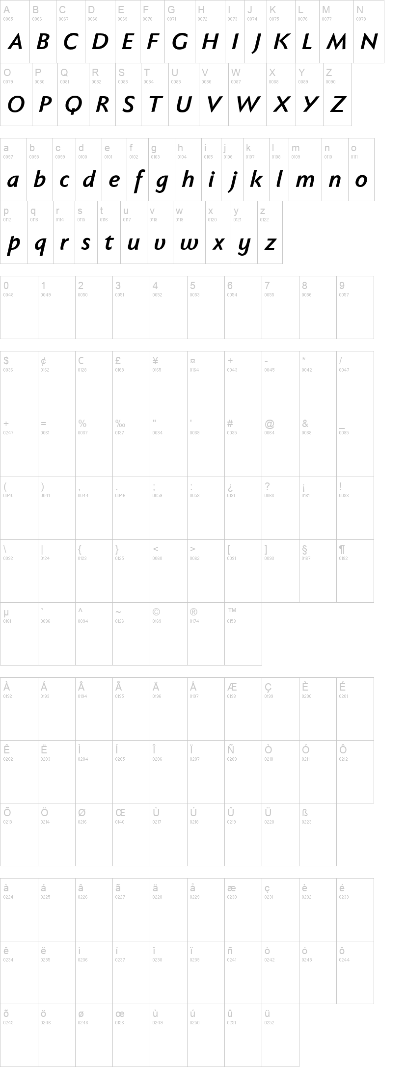
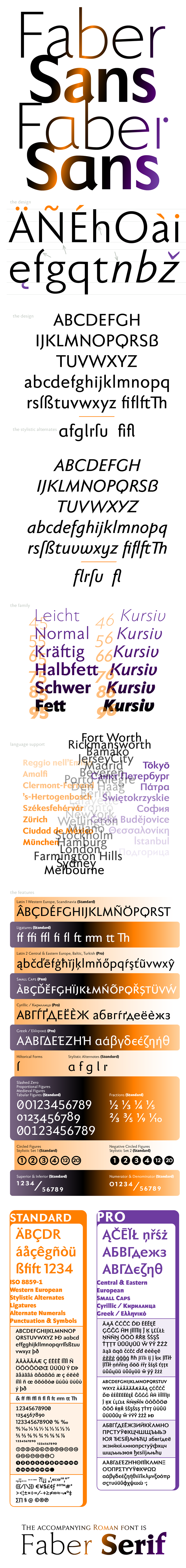
Faber Sans is a sans serif in the classic-modern style of type creations of the early 20th century — godfathered by Futura from Paul Renner and Gill Sans from Eric Gill. And so a font with pleasant rhythmic proportions was created and is extremely comfortable to read, especially in large amounts of text; but, it is also reader-friendly under adverse typographic conditions on the monitor.
A terse character is the f, having a shortened ascender and managing without the usual sweeping bow in reading order.
The determining element in the appearance of Faber Sans is seen in the wide round forms of b c d e o p q and C D G O Q , and this formal characteristic is even more emphasized with the use of the round a and g of the stylistic alternates. Contrast to the soft round forms is provided by the points of all characters derived from the triangle: v w z, and especially the capitals A M N V W Z .
A ”second“ typeface with its own personal character resulted as stylistic alternates were designed for the letters a f g l t u in accordance with the uncial scripts of the late antiquity or rather the early Middle Ages. And the r is given a playful point in the stylistic alternates.
Unlike classic sans serifs, Faber Sans includes a ”true“ italic. The italic characters are not simply just slanted variations of the upright, but the characters originated out of handwriting styles; they are rounder and the stroke flow is more fluent than on the upright letters. Some italic letters truly have their very own design which clearly comes from handwriting, particularly noticeable on a and g.
The font downloadable here is a reduced version (without punctuation, ligatures, numbers etc.). A commercial version of this font (with all features) is available at www.ingofonts.com.
First seen on DaFont: November 14, 2011 - Updated: August 12, 2021
OpenType-TT/FaberSansReduced75.ttf

OpenType-TT/FaberSansReduced76.ttf