
Foro
13.130 posts Fuentes identificadas Sólo solicitudes
Posts de Heron2001


Fuente identificada: Old Press

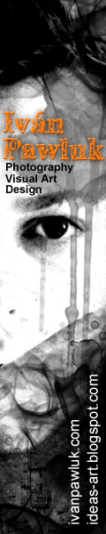
I think the font you really, really want was Laffayette - but it has been removed from the font sites.
Editado 2 veces. Última edición el 08/03/2016 a las 17:25 por Heron2001
Fuente sugerida: Jaws Comic
Editado 2 veces. Última edición el 08/03/2016 a las 17:25 por Heron2001
Fuente identificada: Bodega Sans Medium

Fuente identificada: Trajan
Thank you and mas bien sur - de rein
BTW - the P looks good - but the J seems like it was modified - but it really is all Barkentina..
Enjoy your project!
BTW - the P looks good - but the J seems like it was modified - but it really is all Barkentina..
Enjoy your project!

Fuente identificada: Crackhouse

Fuente sugerida: Bernhard Bold Condensed


Fuente sugerida: Wendy Bold

Fuente sugerida: Avenir

Fuente identificada: Another America
Sorry - none of the repeating letters are the same (or come close) we can only conclude this was handwritten and not a font.
It probably was designed for them.
The REME looks like you can use something like Neo Contact; or Contact; or Old Contact
The K was most likely hand-modified. I can't remember the font that had that "crink" in the K - but there is one out there... I hope someone finds it for you.
The REME looks like you can use something like Neo Contact; or Contact; or Old Contact
The K was most likely hand-modified. I can't remember the font that had that "crink" in the K - but there is one out there... I hope someone finds it for you.
Fuente sugerida: Neo Contact
We had this one recently - and we determined it probably wasn't a font. The two Es and two Ss do not repeat - they are different. So sorry.


Fuente identificada: Algerian
Alsol like:
Aprillia: https://creativemarket.com/Olexstudio/426864-Aprillia-Script
Debby Script: https://www.behance.net/gallery/30300095/Debby-%28Free-Font%29
Fabulous Script: https://creativemarket.com/dhanstudio/443775-Fabulous-Script
Gracias: https://creativemarket.com/FontGraphicLand/442347-Gracias-Typeface
and many more on creativemarket.com

Similar - round out edges when outlining and modify Y a little bit.
Fuente identificada: Phenix American
Huso horario CEST. Ahora son las 16:23
