

Foro
1.506 fuente identificadas Todos los posts Sólo solicitudes
Fuentes identificadas por skomii

Big Caslon is the one which matches the most. Must be the MEDIUM weight, but I couldn't find it, nor from Font Bureau
Fuente identificada: Big Caslon
Fuente identificada: Interstate Thin

Fuente identificada: Narnia BLL

Fuente identificada: Wiesbaden Swing

Fuente identificada: Mr Canfields

Fuente identificada: Arista Pro


Fuente identificada: Roof Runners

Fuente identificada: Percolator

Helvetica Neue Pro UltraLight, with the W flipped vertically to look like a M, and with a good eye, I bet the X was flipped vertically too. You can make the comparison in this image:

Do you agree ???
Editado el 26/04/2013 a las 04:09 por skomii
Do you agree ???
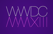
Fuente identificada: Helvetica Neue Pro UltraLight
Editado el 26/04/2013 a las 04:09 por skomii

Fuente identificada: Painted


Fuente identificada: ITC Bauhaus

Some glyphs are different, maybe because Ray updated it ???
Editado el 25/04/2013 a las 18:56 por skomii
Fuente identificada: V-Dub
Editado el 25/04/2013 a las 18:56 por skomii

Fuente identificada: Simplesnails

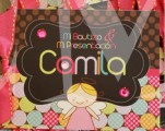
Fuente identificada: Lavanderia
Huso horario CEST. Ahora son las 12:15
