

Foro
355 fuente identificadas Todos los posts Sólo solicitudes
Fuentes identificadas por hubris

Fuente identificada: Ranger


Fuente identificada: Storybook

Fuente identificada: Seans Other Hand


Some online previews display the M strangely but I downloaded the freeware version and it looks fine.

Editado el 23/04/2012 a las 18:42 por hubris
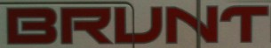
Fuente identificada: SF Beaverton
Editado el 23/04/2012 a las 18:42 por hubris
it's the same font for "bff" in your other post
http://www.dafont.com/forum/read/47769/font-name-please#post
Editado el 23/04/2012 a las 18:17 por hubris
http://www.dafont.com/forum/read/47769/font-name-please#post
Fuente identificada: All Hail Julia
Editado el 23/04/2012 a las 18:17 por hubris
Fuente identificada: Xirod

Fuente identificada: Bright Young Things

Fuente identificada: Freestyle Script


Sign Painter-House Casual, with custom k (possibly based on the uppercase)
Editado 2 veces. Última edición el 18/04/2012 a las 17:01 por rocamaco
Fuente identificada: House Casual
Editado 2 veces. Última edición el 18/04/2012 a las 17:01 por rocamaco
Fuente identificada: New Yorker

"Bar & Grill"
Editado 2 veces. Última edición el 16/04/2012 a las 22:45 por hubris
Fuente identificada: Gillies Gothic Bold
Editado 2 veces. Última edición el 16/04/2012 a las 22:45 por hubris

Fuente identificada: Mistral

Fuente identificada: Avanti
Huso horario CEST. Ahora son las 07:18
