
Foro
208 posts Fuentes identificadas Sólo solicitudes
Posts de LaurenRuth

Yep. It appears to be a modified/decorative/customized Romeo DN-based creation.

I can't tell you what font the used for "Versailles" (sorry!) but the font used for "Philharmonic Quintet" is a MT Footlight, with modified 'Q' and tittles for the 'i' dots.
Fuente sugerida: MT Footlight

Fuente identificada: Champagne & Limousines

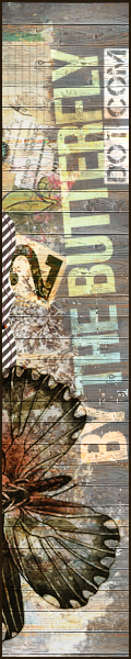
Fuente identificada: Fantastica
Unsuspecting font seekers have no idea what they are in for.
Hi guys, sorry, I am only seeing this on the forum now.
@Gabriella77, I received your emails, but when I visited your site it appeared you had (at that time removed my font) so I was unable to view the issues you described. I came upon this thread just as I was going to email you to ask for more details.
I am pleased to discover from reading the discussion here that you were able to come to a very simple solution to the problem and continue using the font. Headlines in HTML *are* bold, a good thing to keep in mind especially when web-embedding specific fonts.
<3
Lauren
Here's one ... http://www.dafont.com/brutal-tooth.font?psize=l&text=Chelsea+Grin
Editado el 25/02/2013 a las 21:50 por Rodolphe
Editado el 25/02/2013 a las 21:50 por Rodolphe
Welcomes 

You are very welcome 


Fuente identificada: Scriptina

Fuente identificada: KG Fall For You

I don't know if this may be useful to you or not because it is not the exact design you request and maybe you have seen it before, but the New York City font http://www.dafont.com/new-york-city.font?text=MANHATTAN ) has a similar theme to this.

That is Champagne & Limousines with a system or renderer(sp?) generated bold.
Fuente identificada: Champagne & Limousines
Awww, shucks he he. I <3 Dafont
Thanks so much.
Hey, I just thought I would let the folks at Dafont know that there are two spam comments on my font that you might like to remove.
http://www.dafont.com/font-comment.php?file=champagne_limousines
~Lauren
http://www.dafont.com/font-comment.php?file=champagne_limousines
~Lauren
@DPape,
Yes, I know. This is why I haven't done anything about it, nor do I intend to. And nah... I am not even going to contact the moderators there. I am not really too worried about it. I can tell you this though, the things being said, are without a doubt entirely not true.
Thank you though,
Lauren
Yes, I know. This is why I haven't done anything about it, nor do I intend to. And nah... I am not even going to contact the moderators there. I am not really too worried about it. I can tell you this though, the things being said, are without a doubt entirely not true.
Thank you though,
Lauren
@Dick Pape
Thank you. I know what you mean. I have seen some posts on typophile regarding Aver that in my opinion are nothing short of slander. Seriously. They have no idea what they are talking about.
~Lauren (nymphont/nymfont)
Thank you. I know what you mean. I have seen some posts on typophile regarding Aver that in my opinion are nothing short of slander. Seriously. They have no idea what they are talking about.
~Lauren (nymphont/nymfont)
Thanks for the run-down koeiekat.
"After all the files I put on dafont are not my own type designs but revivals of ancient designs that have never been digitized"~ As if that's anything to scoff at! I have to admit I am suprised by your modesty in regards to your work, you know, given your given your expertise and penchant for being quick witted. XD
You do it all for the cats. Aww. Speaking of animal causes, PETA should be using my Robinne font in an upcoming ad campaigne. (Fingers crossed!)
I agree that "private use," makes more sense than "personal use," I might start wording it this way as well.
Huso horario CEST. Ahora son las 07:11
