

Foro
7.074 fuente identificadas Todos los posts Sólo solicitudes
Fuentes identificadas por fmontpetit


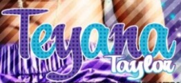
Fuente identificada: Carolyna Pro Black


Fuente identificada: Bebas Neue

There are many versions of Franklin Gothic, this one seems to fit.
Editado el 28/07/2013 a las 14:30 por fmontpetit
Fuente identificada: Franklin Gothic
Editado el 28/07/2013 a las 14:30 por fmontpetit

Fuente identificada: LHF Casablanca
Fuente identificada: Roboto

Fuente identificada: Arial

Fuente identificada: Cooper Black

Fuente identificada: Kendaia

Can't be 100% sure but it looks like Helvetica Bold...
Edit: Since you edited your post to change the image, and I also found an image for the logo, I confirm that it is indeed Helvetica Bold (with that tiny modification to the inside of the letter 'A'). It is also condensed (about 90%)

Editado 2 veces. Última edición el 28/07/2013 a las 04:23 por fmontpetit
Edit: Since you edited your post to change the image, and I also found an image for the logo, I confirm that it is indeed Helvetica Bold (with that tiny modification to the inside of the letter 'A'). It is also condensed (about 90%)
Fuente identificada: Helvetica
Editado 2 veces. Última edición el 28/07/2013 a las 04:23 por fmontpetit

Fuente identificada: Calgary Script

Fuente identificada: Alex Brush
Fuente identificada: Mr Kleen

Fuente identificada: Trade Gothic

Fuente identificada: Myriad


Fuente identificada: Freehand 521

Fuente identificada: Woodblock

Fuente identificada: Dinski Casual Condensed
Huso horario CEST. Ahora son las 02:06
